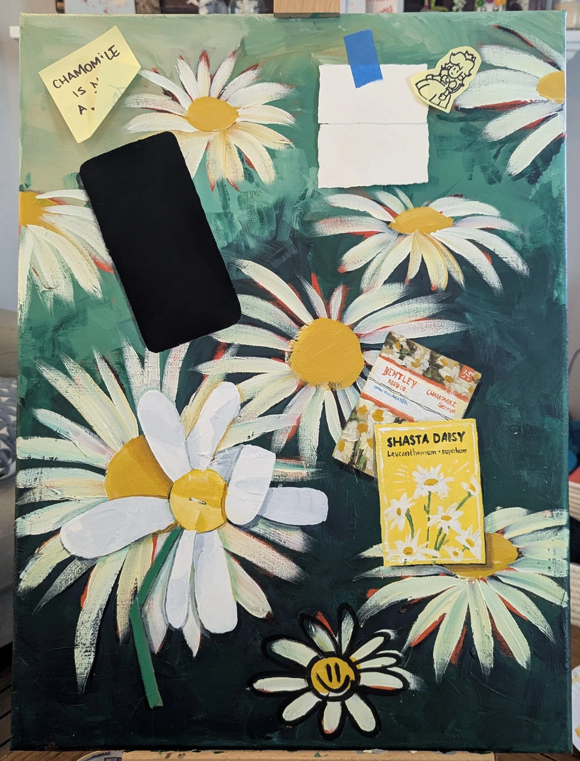
Chamomile is not a Daisy
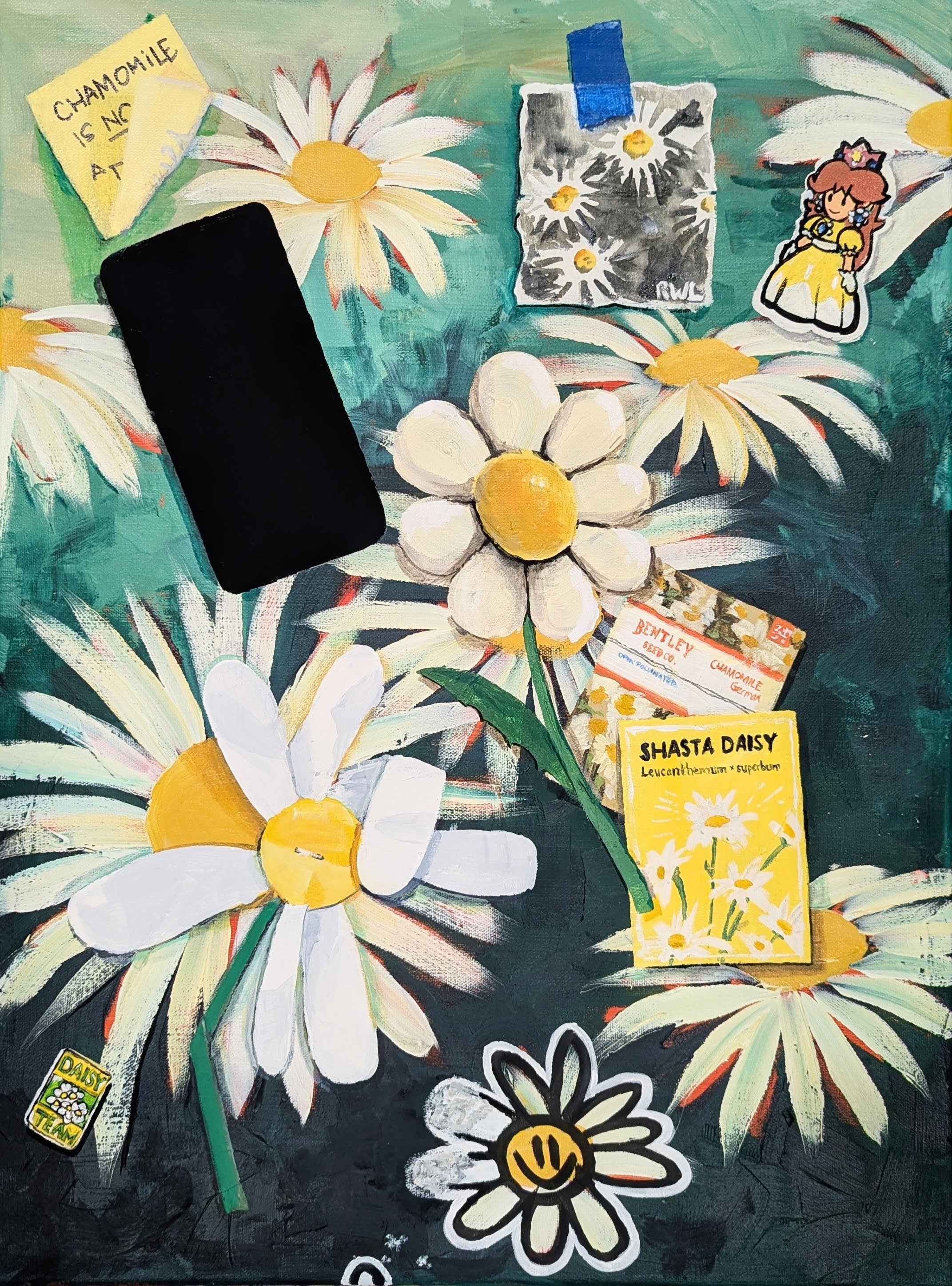
‘Chamomile is not a Daisy’
18” x 24”
acrylic on canvas
This painting happened because I needed something for the June Long Beach exhibit and a Huntington Arts Council call for Nature-based experimental artwork.
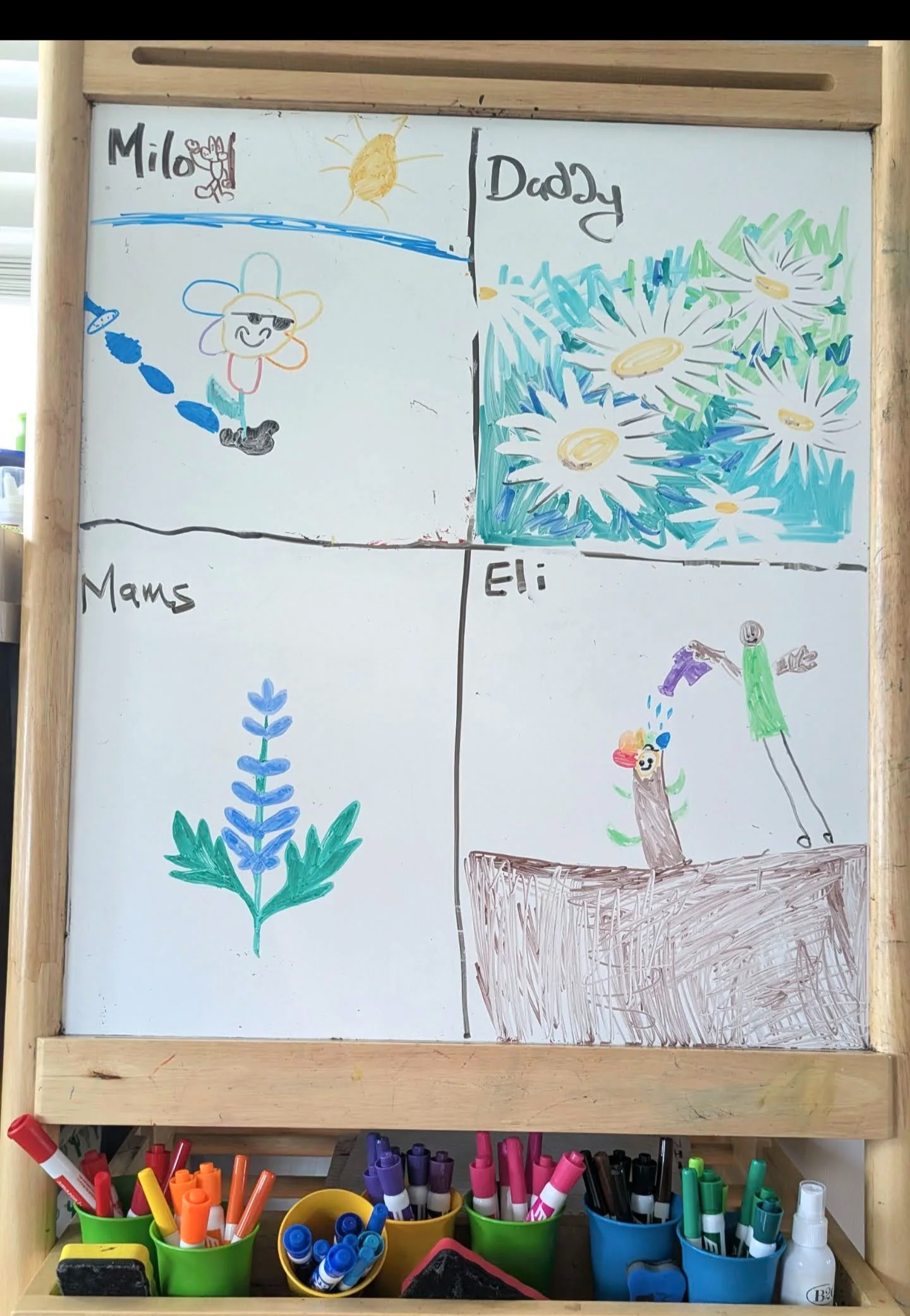
On the easel our family does themed drawings. Sometimes they stay up for weeks; sometimes erased after a day. Recently we did flowers, and I like my daisies here so I used that as a basis for my painting.
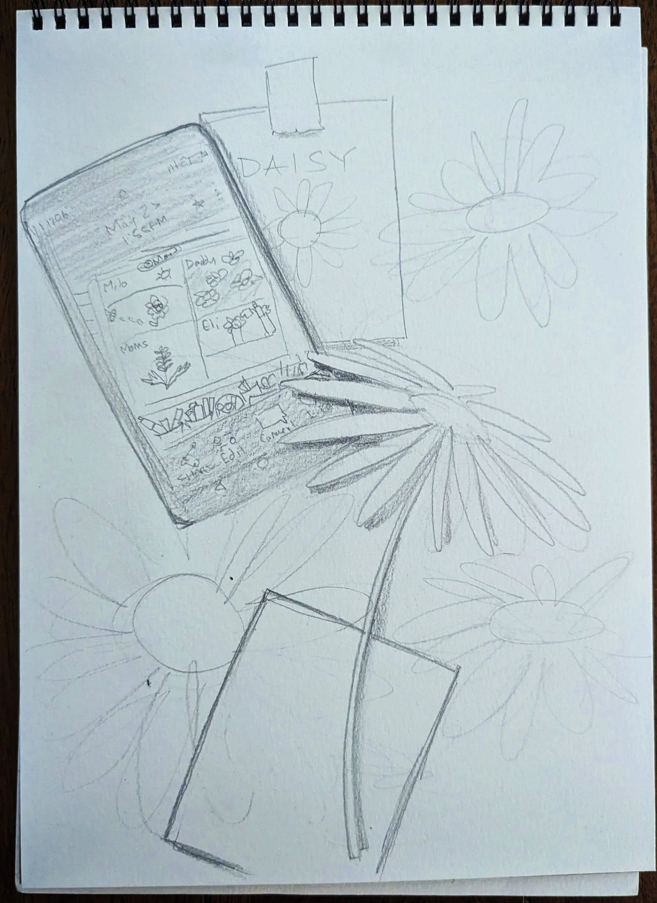
The original idea was to recreate these daisies and then on top of it have my phone with this picture of the family art sitting on top of it. With a packet of daisy seeds sitting near the phone.
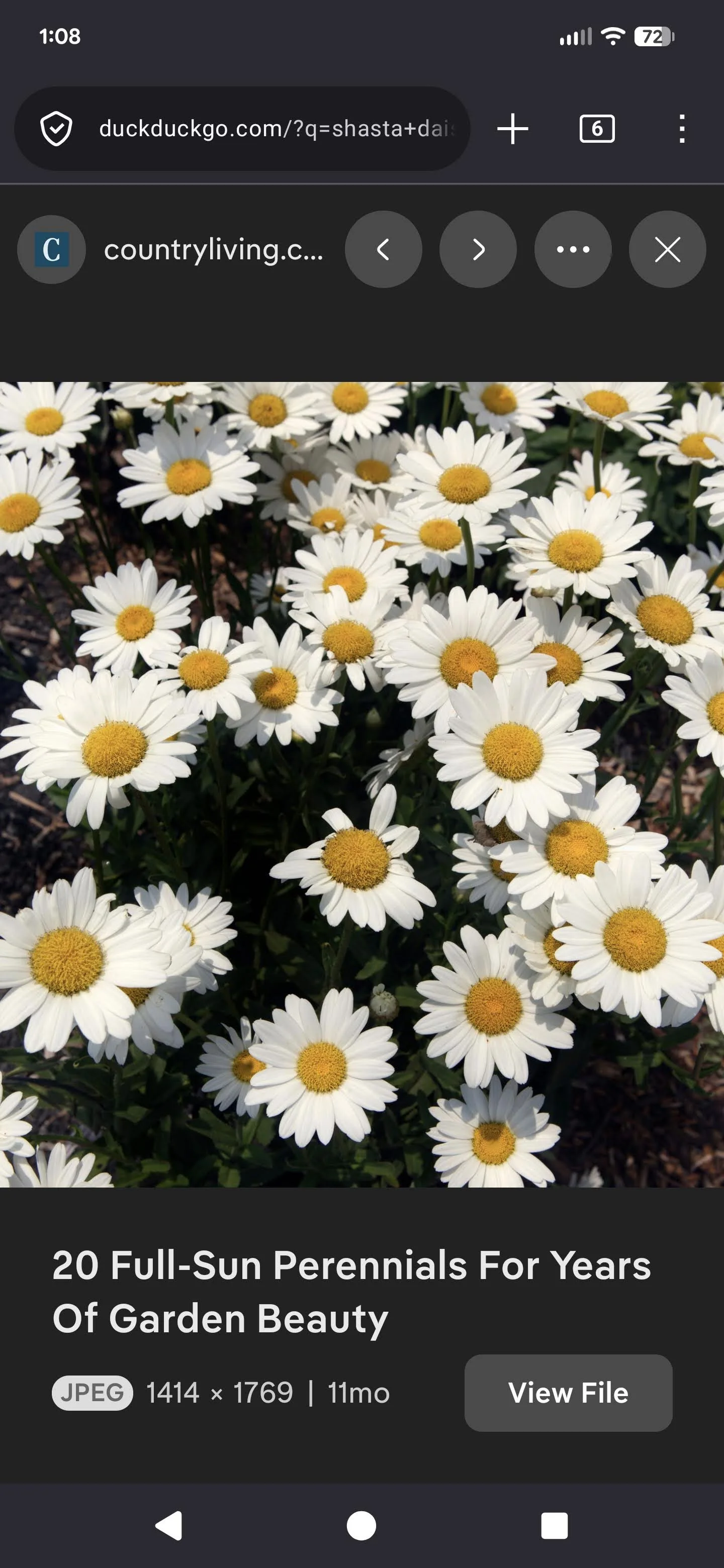
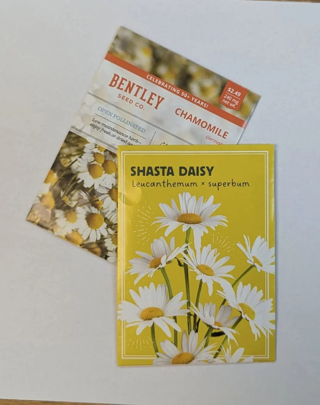
Below I have my original sketch which shows the easel photo on my phone. These’s also some reference photos of daisies. And then the photos of the seed packets from the library.
[[Every month from spring to fall, my local library allows each patron to take 3 packets of seeds. I had already taken my allotment before starting this painting so I had to go in and take pictures of the shasta daisies and chamomile. I later found a daisy packet in my garage.]]

To start the painting I wanted to follow the process of landscape painter Jim Musil. On his website he clearly outlines his process of painting. You can look at that here.
I skimmed it but admittedly did not actually read it until after I started. I started by painting my entire canvas orange, then i started drawing daisies and then added the darks, then greens, then yellows/whites.
Also, I painted most of this in the living room on the coffee table because Laura was stuck home because of the LIRR not paying their workers enough.
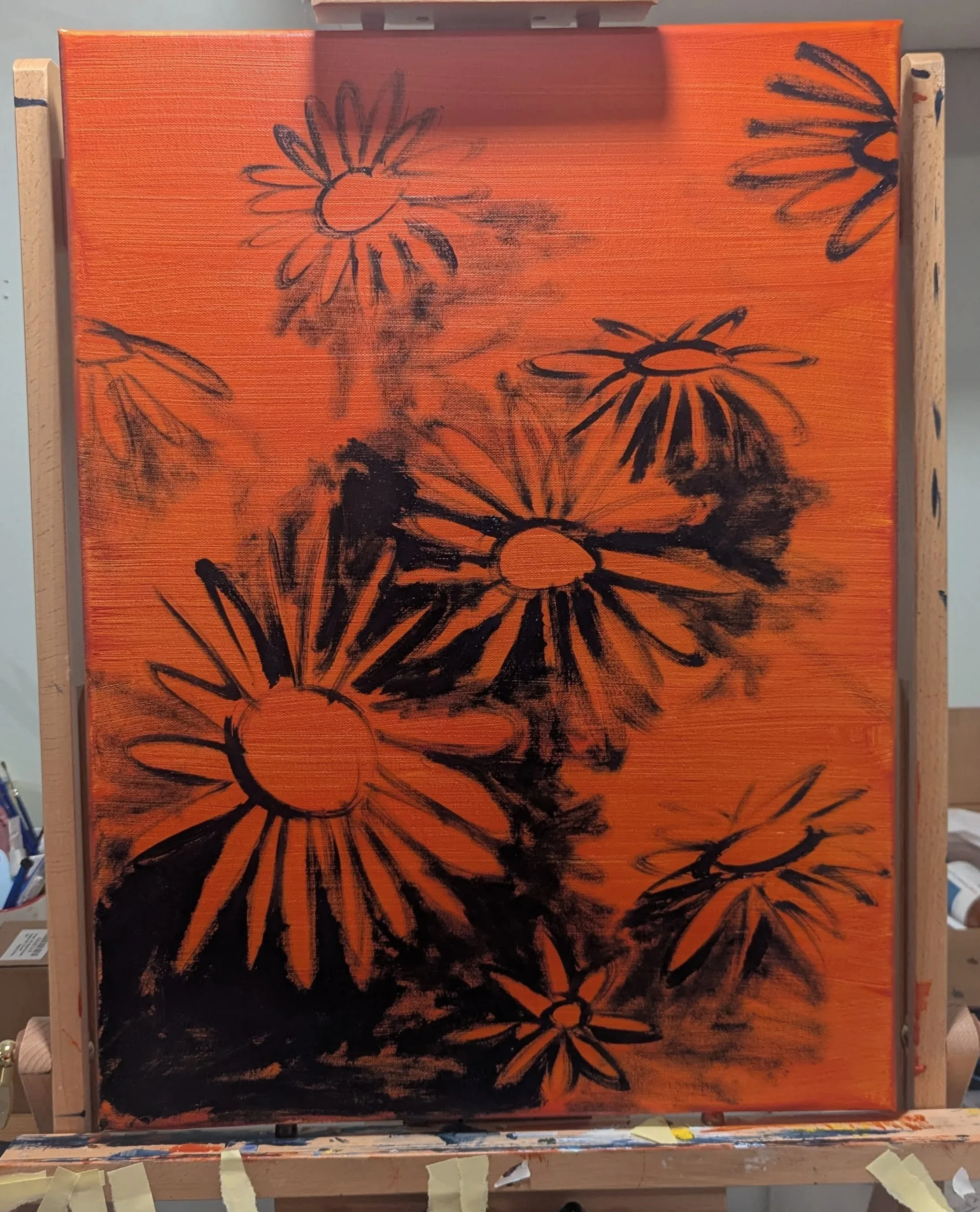
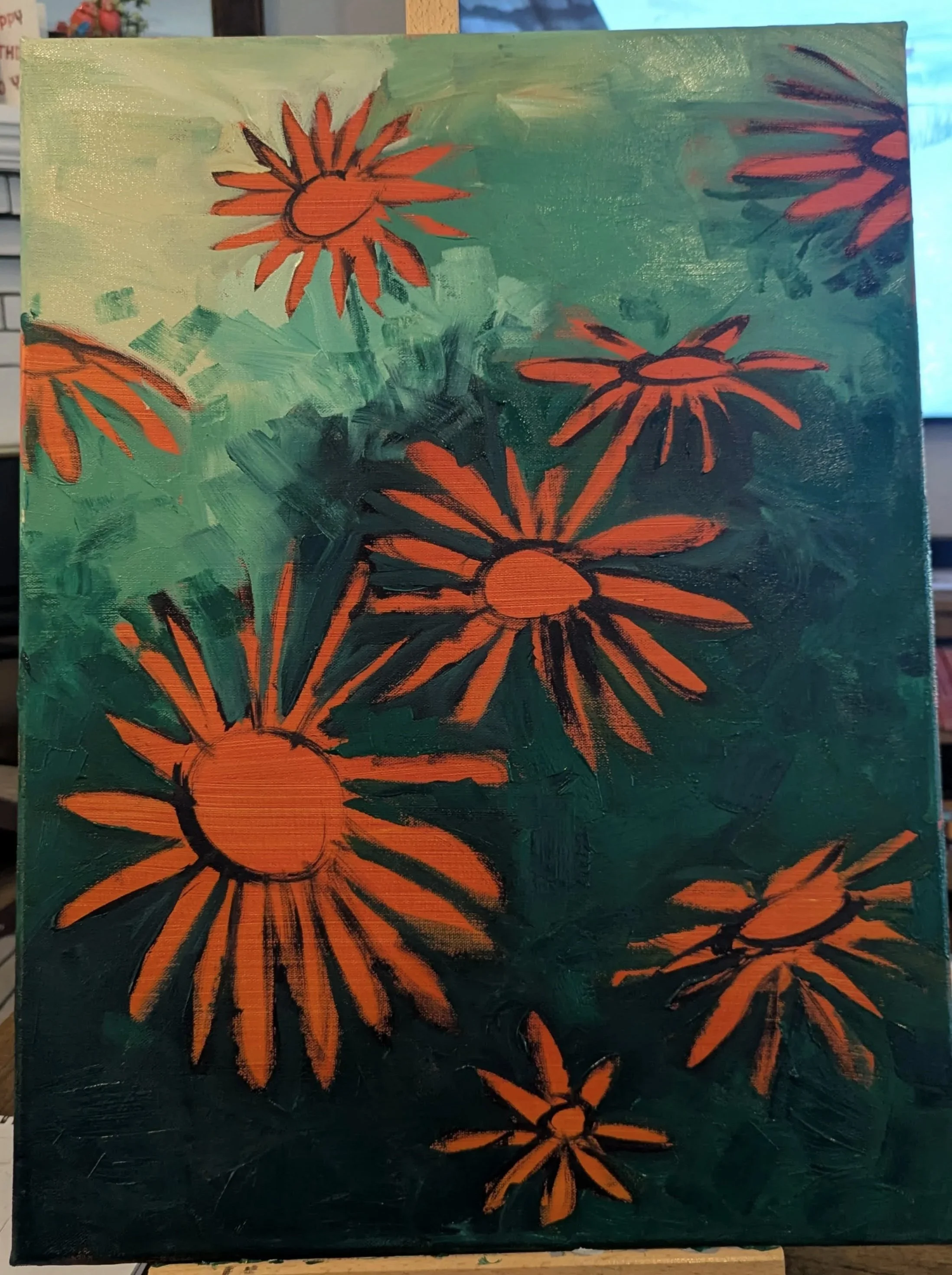
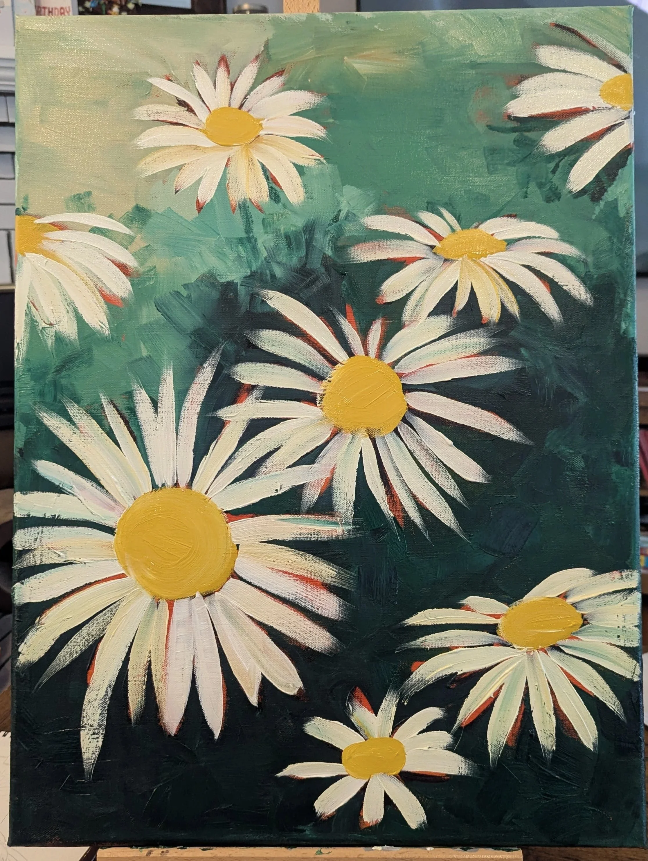
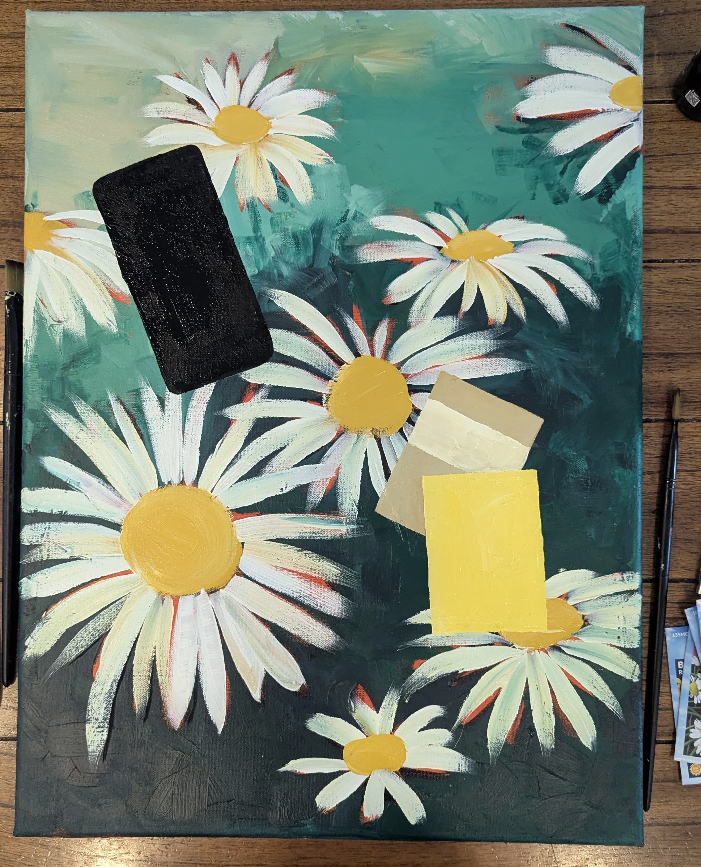
This was all pretty impressionist, which I was pretty happy with. I really like the daisy on the top left, it probably has the best depth to it. Now was time to add the phone and the seed packets. Here I start to stray from my initial idea because the canvas is so much larger than the paper I sketched on.
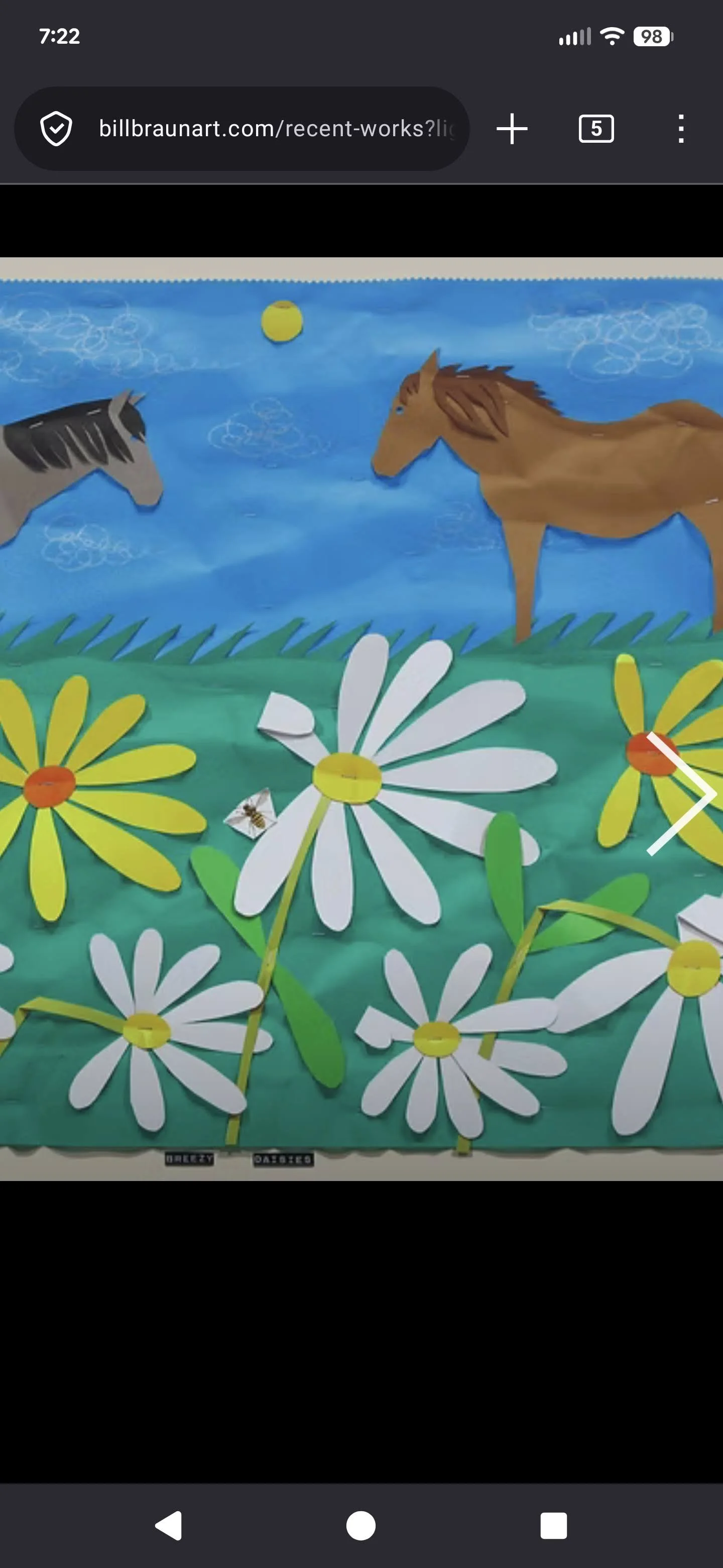
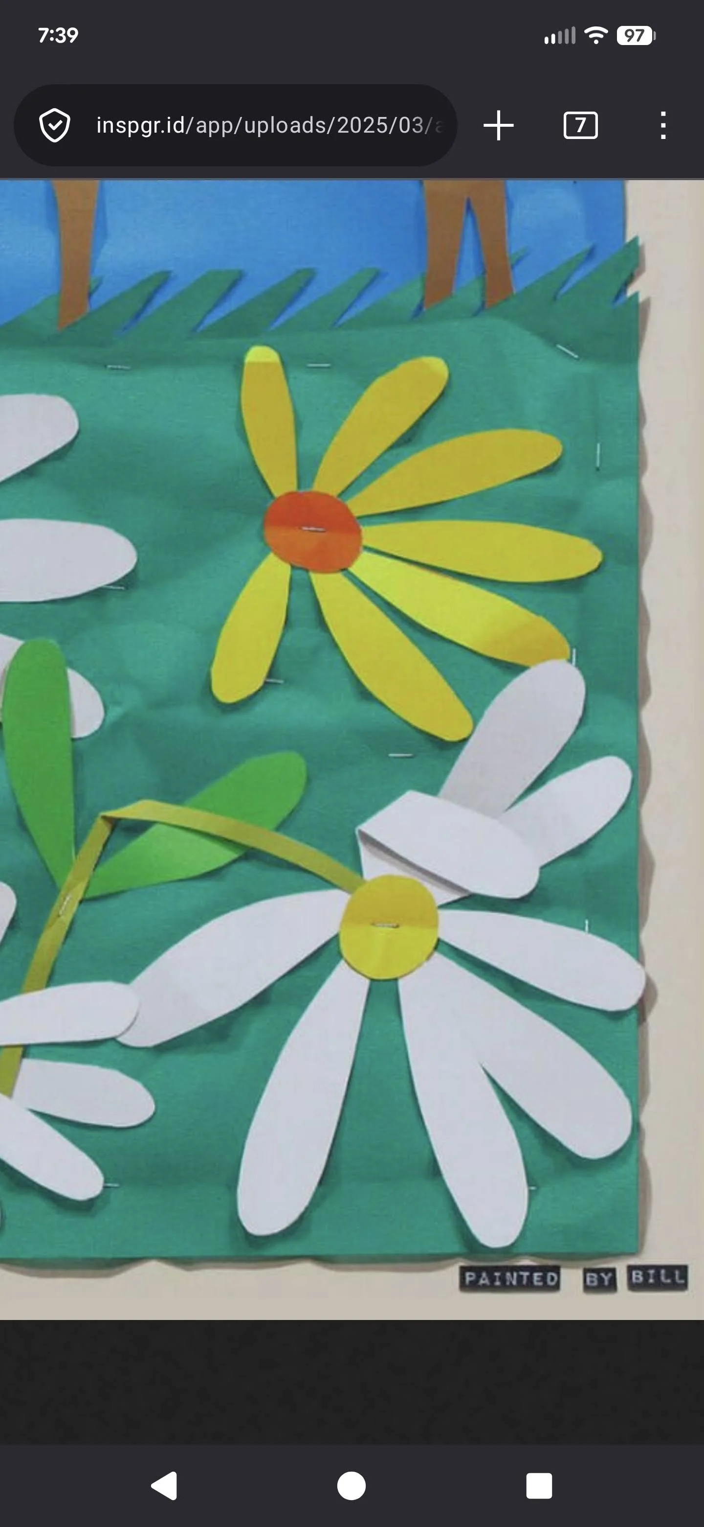
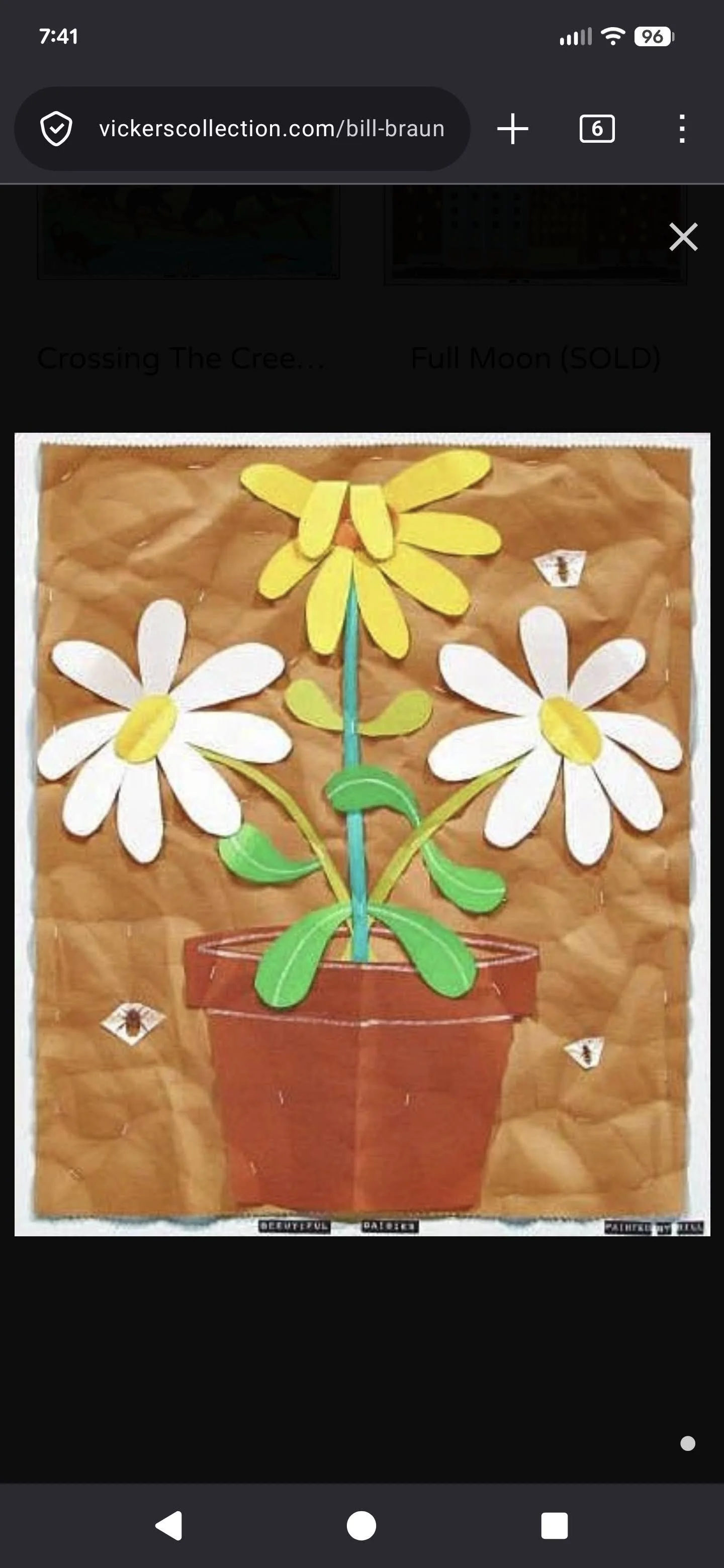
Something else I wanted to try to implement as to make paper look like paper.
I was inspired/motivated by Bill Braun’s work. (Which I found from Derek Owens’ class.) All of his work is acrylic and it looks like construction paper. So I tried doing that but it didn’t really work out.
I also started to try to start rendering the phone, in the sense of where my case shows and where the speaker is. That didn’t really work out. I also continuously tried to pick it up, and then decided I kind of liked the arrogance of a big black block in the middle of a painting.
I also stickerized that bottom daisy, which brought me to my next idea.
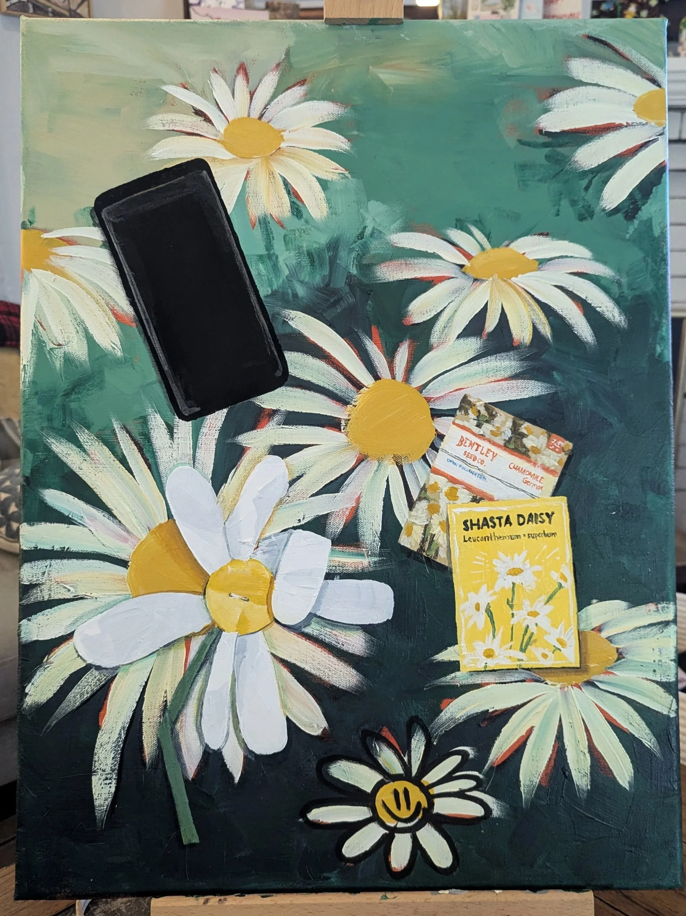
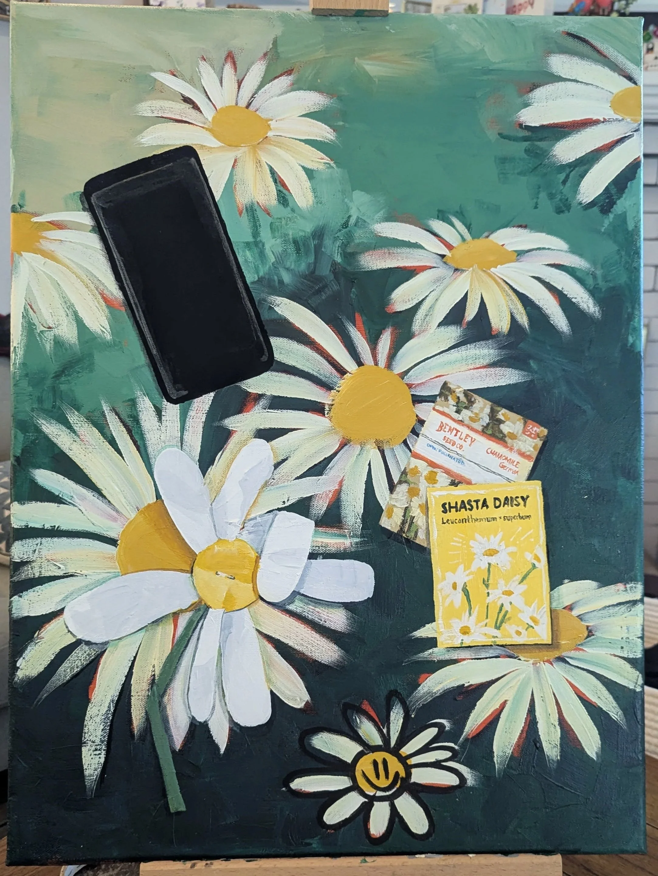
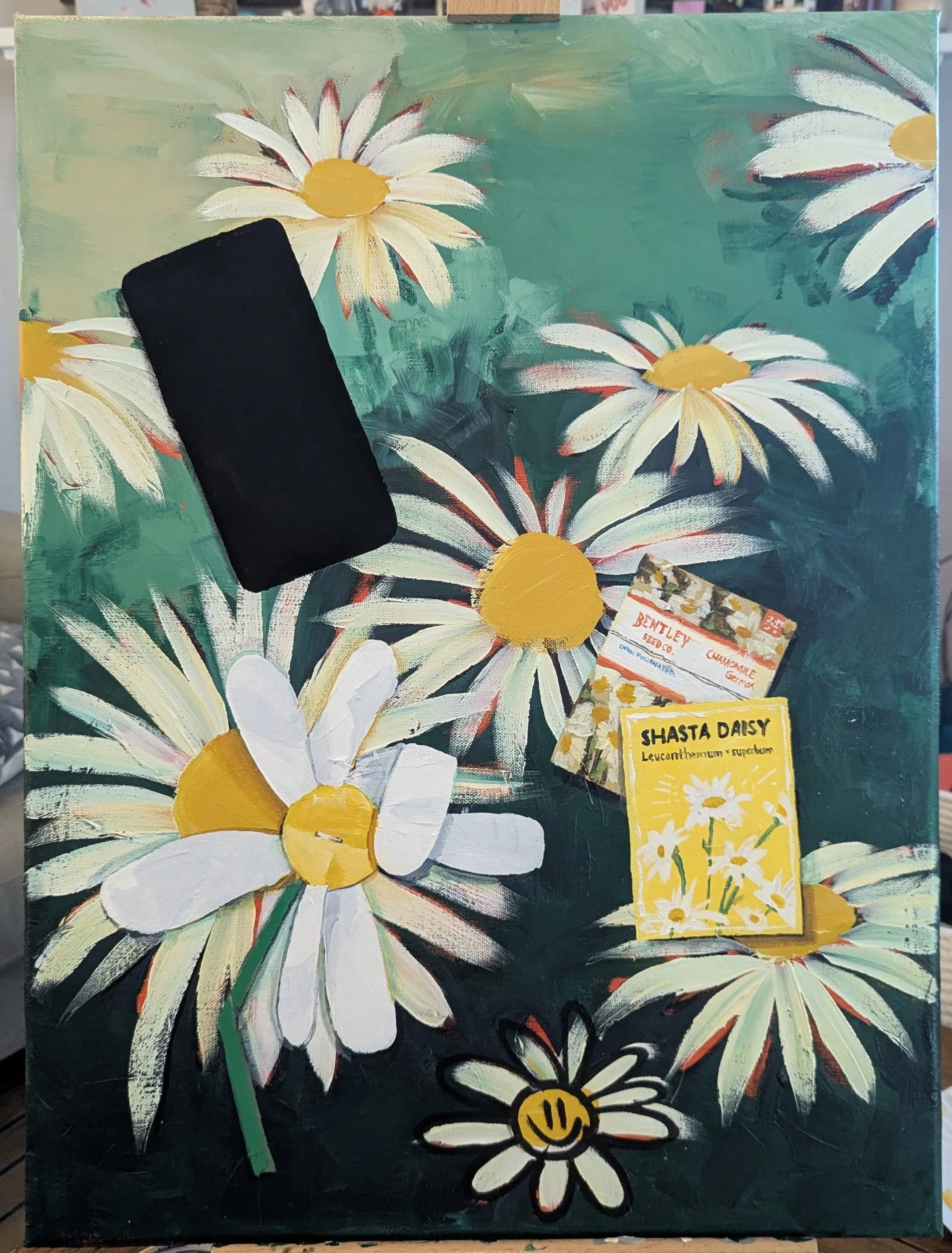
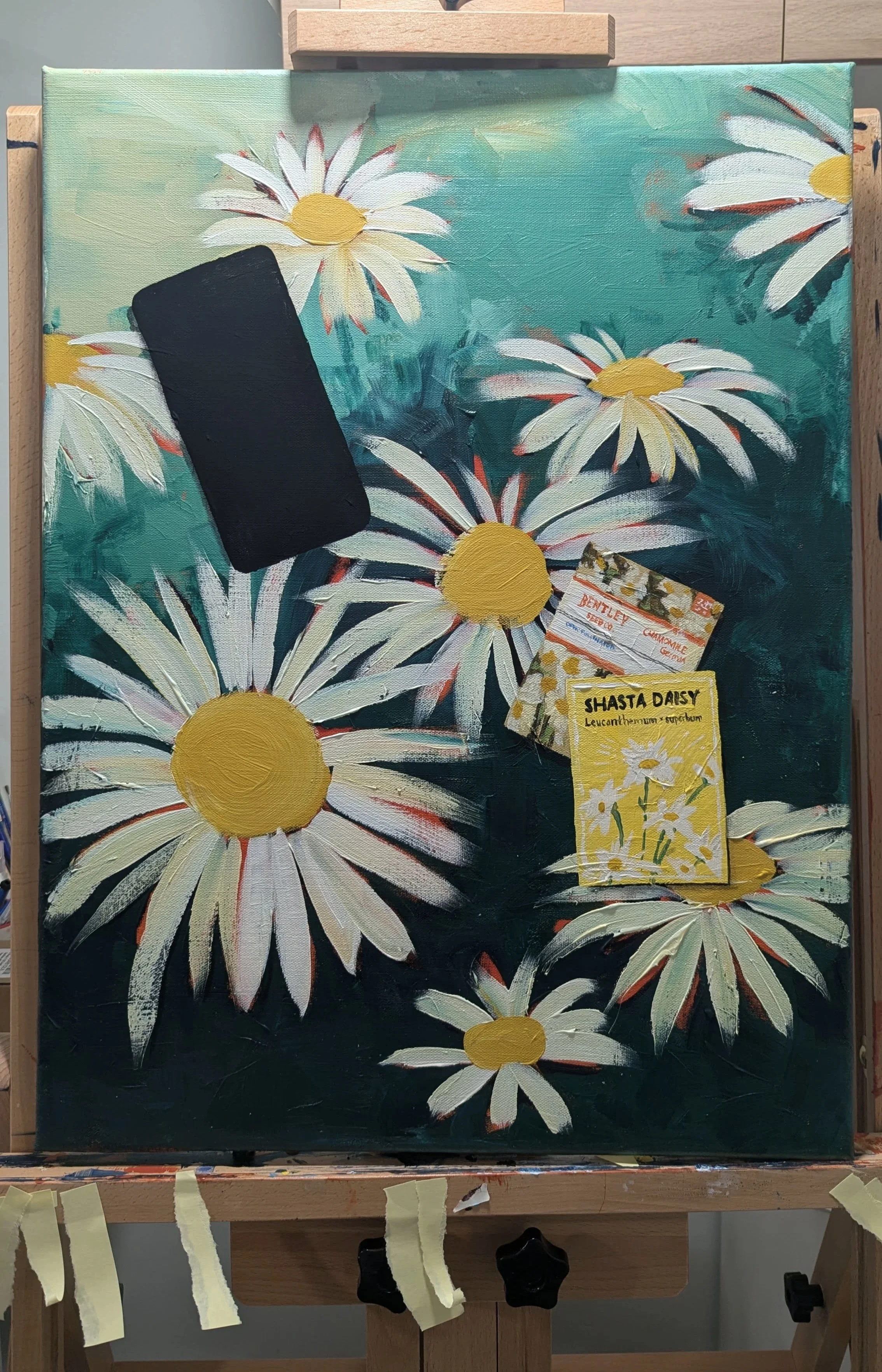
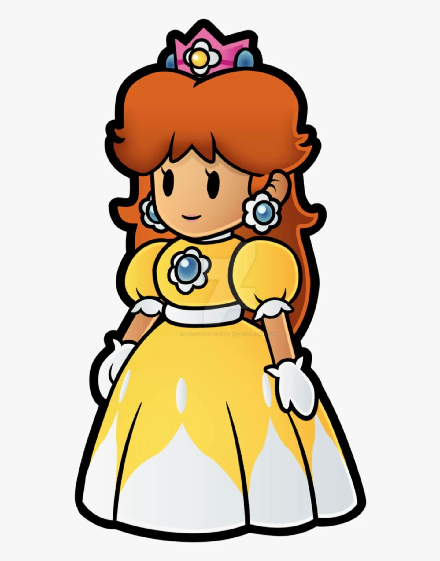
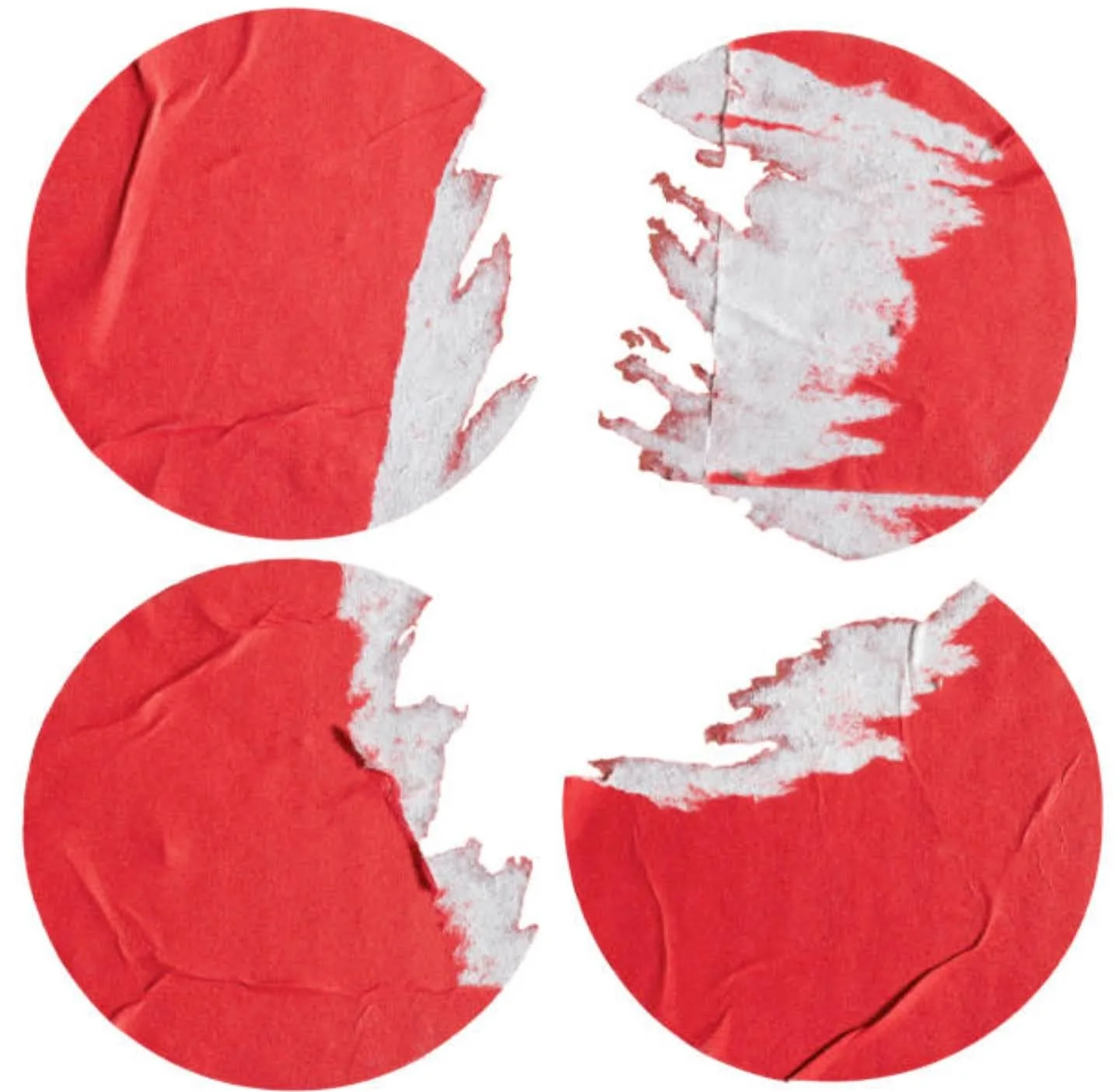
At this point I think I start tinkering with shadows to create that depth I need to sell the trompe l’oeil look I’m going for. I also start considering a Princess Daisy sticker. I also felt I needed to differentiate the flower on the bottom into a torn sticker so tried recreating that look.
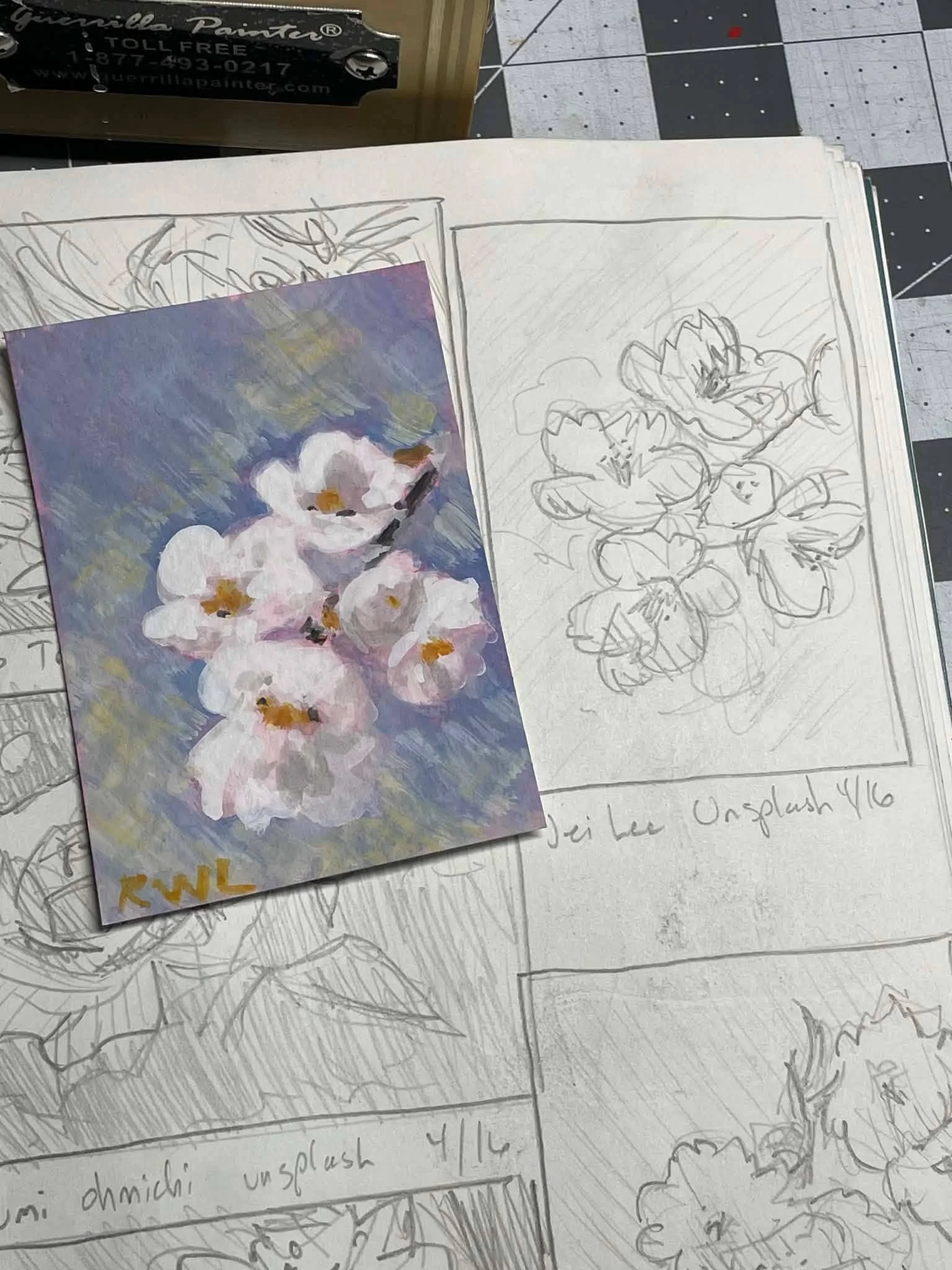
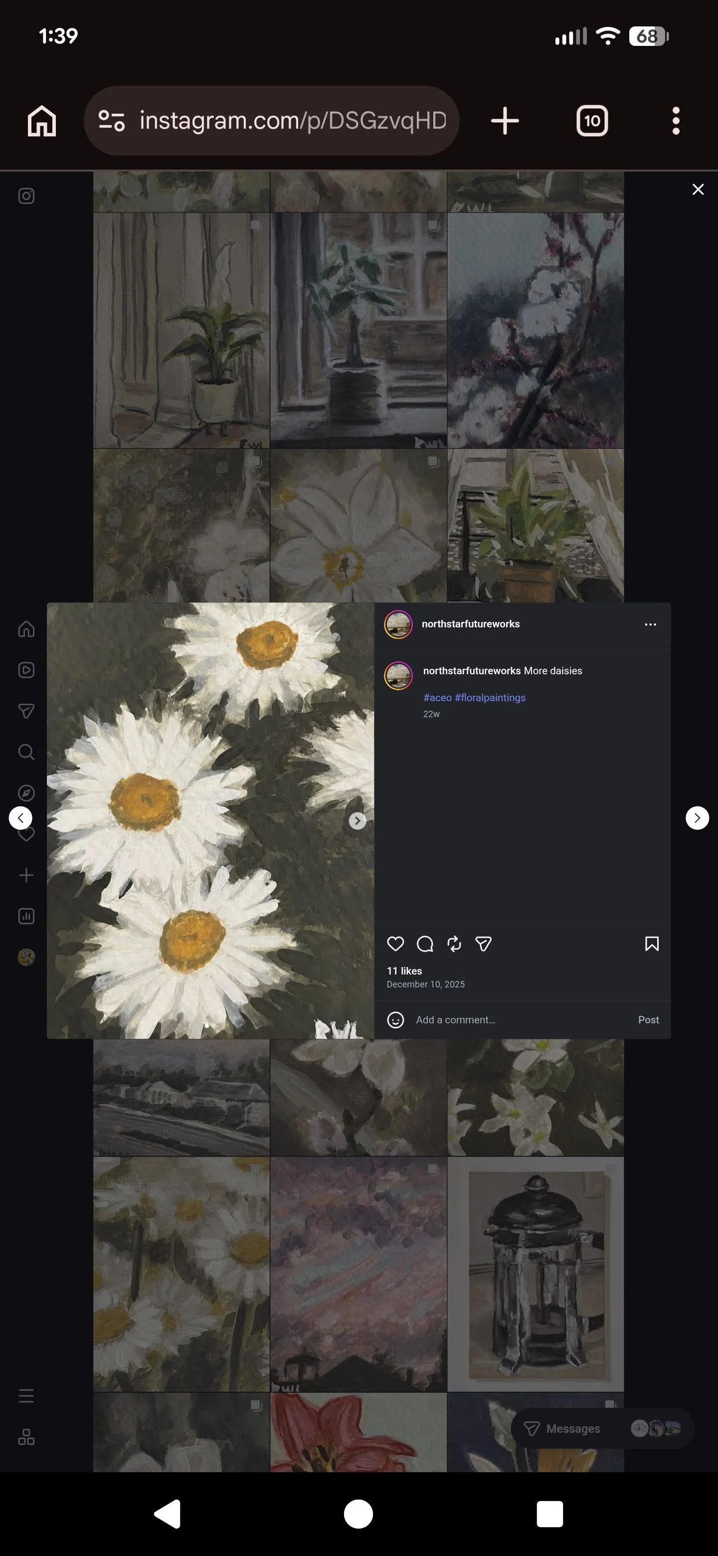
A discord RGD friend, recently posted that photo of his painting on top of his sketches which I really enjoyed and I was going to throw that onto the painting but then I found he had daisy paintings on his IG. He typically makes trading card sized paintings which is somethings I’d like to get into. - I tried to make it look like two trading card sized papers were taped up top and then his daisy painting painted on them. I actually used watercolor ground on top of the “paper” which made painting with watered-down acrylics feel like watercolor. That was a fun experiment.
I also added this post it saying “Chamomile is not a Daisy” because I have that packet of chamomile seeds down there. I folded it up for visual interest.
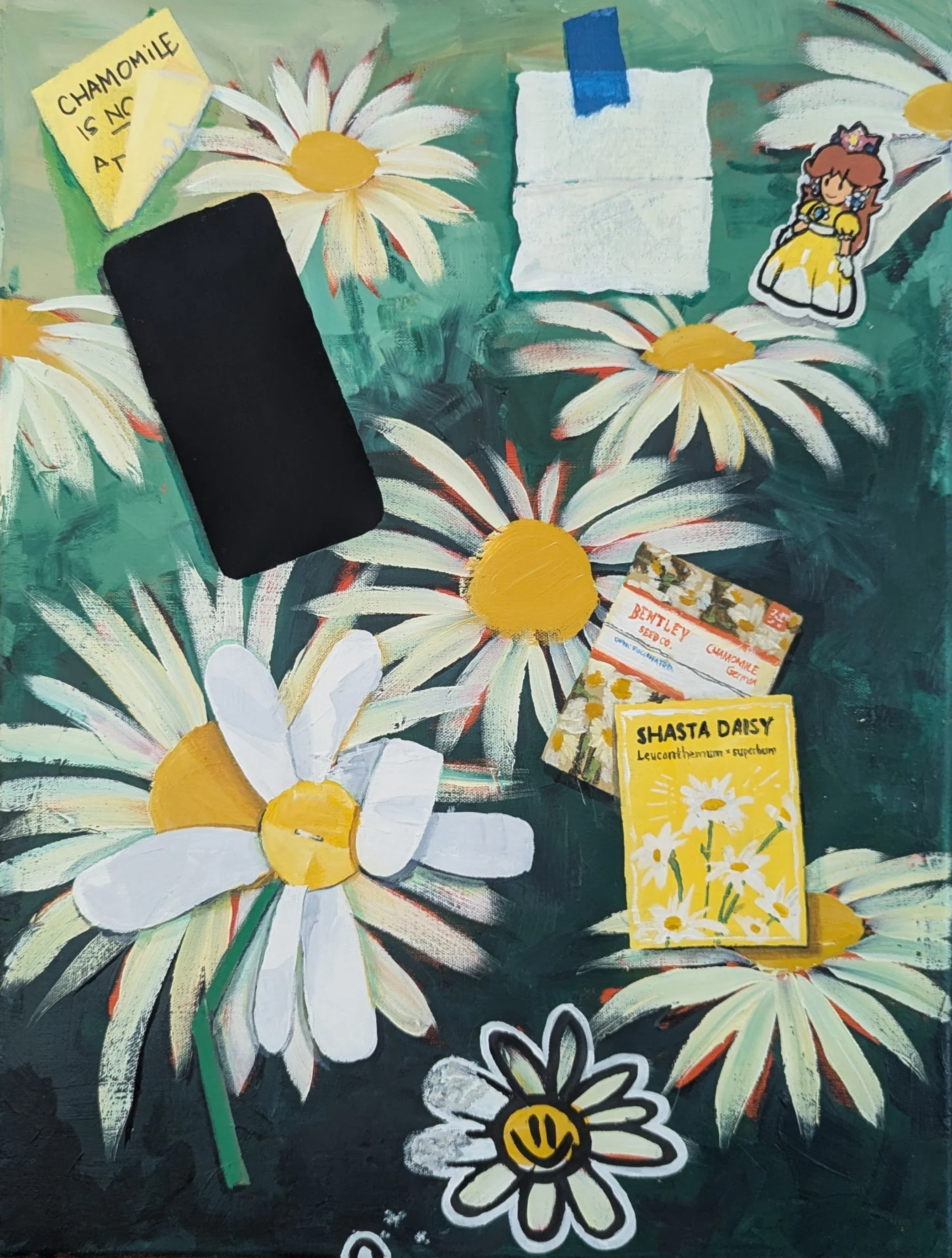
The last few things I added I struggled with.
I really wanted a packet of seeds torn open and seeds sprinkled out, but I didn’t really have anywhere to do that.
I wanted a realistic daisy laying on top dead center but my daisies are just about budding and certainly aren’t blooming.
Laura suggested a glass daisy, and then daisy buttons, which is what I decided I would do. When looking for references I came across two things. A clay-rendered daisy, which I thought was interesting enough for a change in texture.
And… The Daisy Foundation. TDF is a group that celebrates nurses and they give our these cool little pins. So I added one of them, but it was too small and my tiny brushes are garbage. I have a really hard time making acrylic paint movable enough without watering it down.
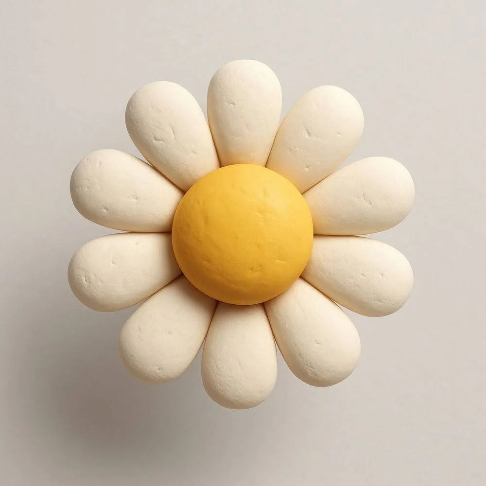
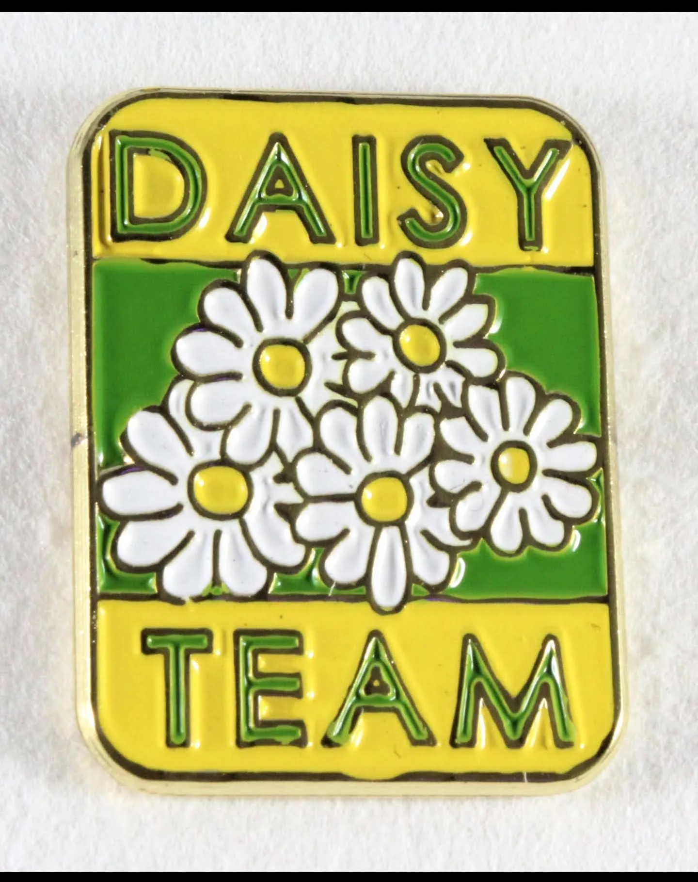
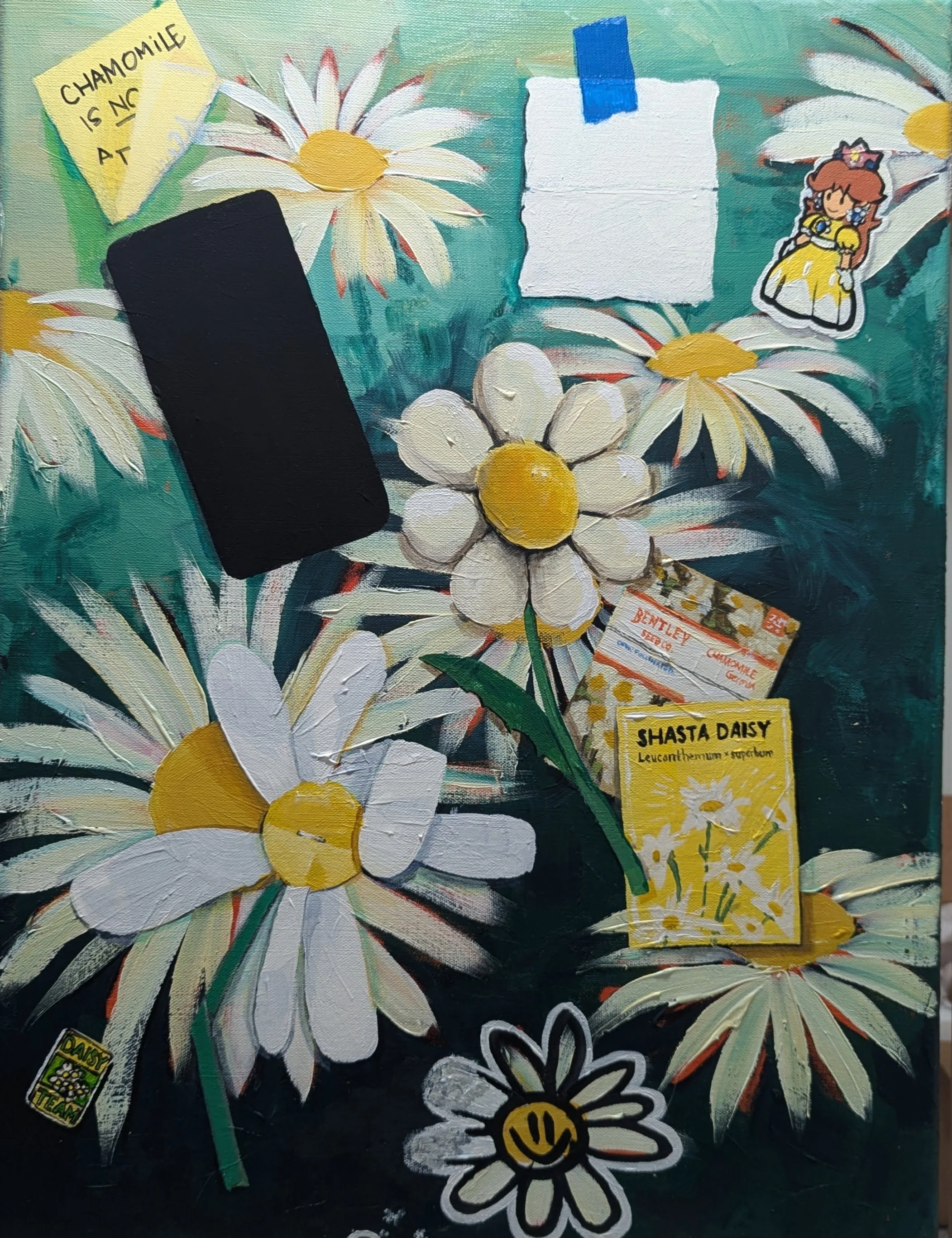
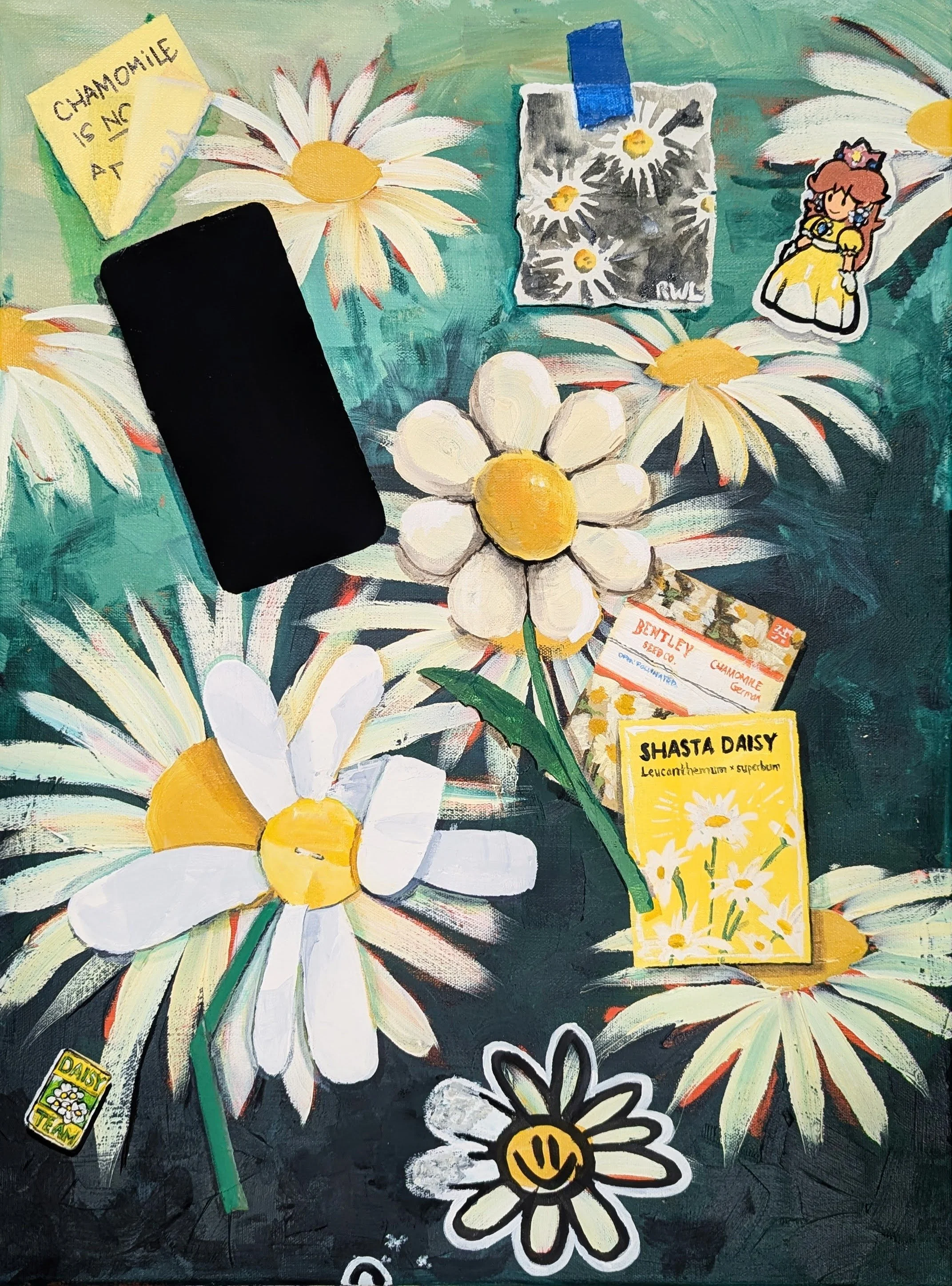
And that’s pretty much that.
From here I fiddled with the pin a little bit because I really didn’t like how it turned out. I also fiddled with shadows trying to create more depth.
—
Something I did differently in this painting with the shadows.
Typically I just water down or use liquin to glaze black as a shadow. I noticed on Bill Braun’s work that he seems to just use a darker version of the color that’s in shadow so I tried that, and I think it sells the illusion better.
