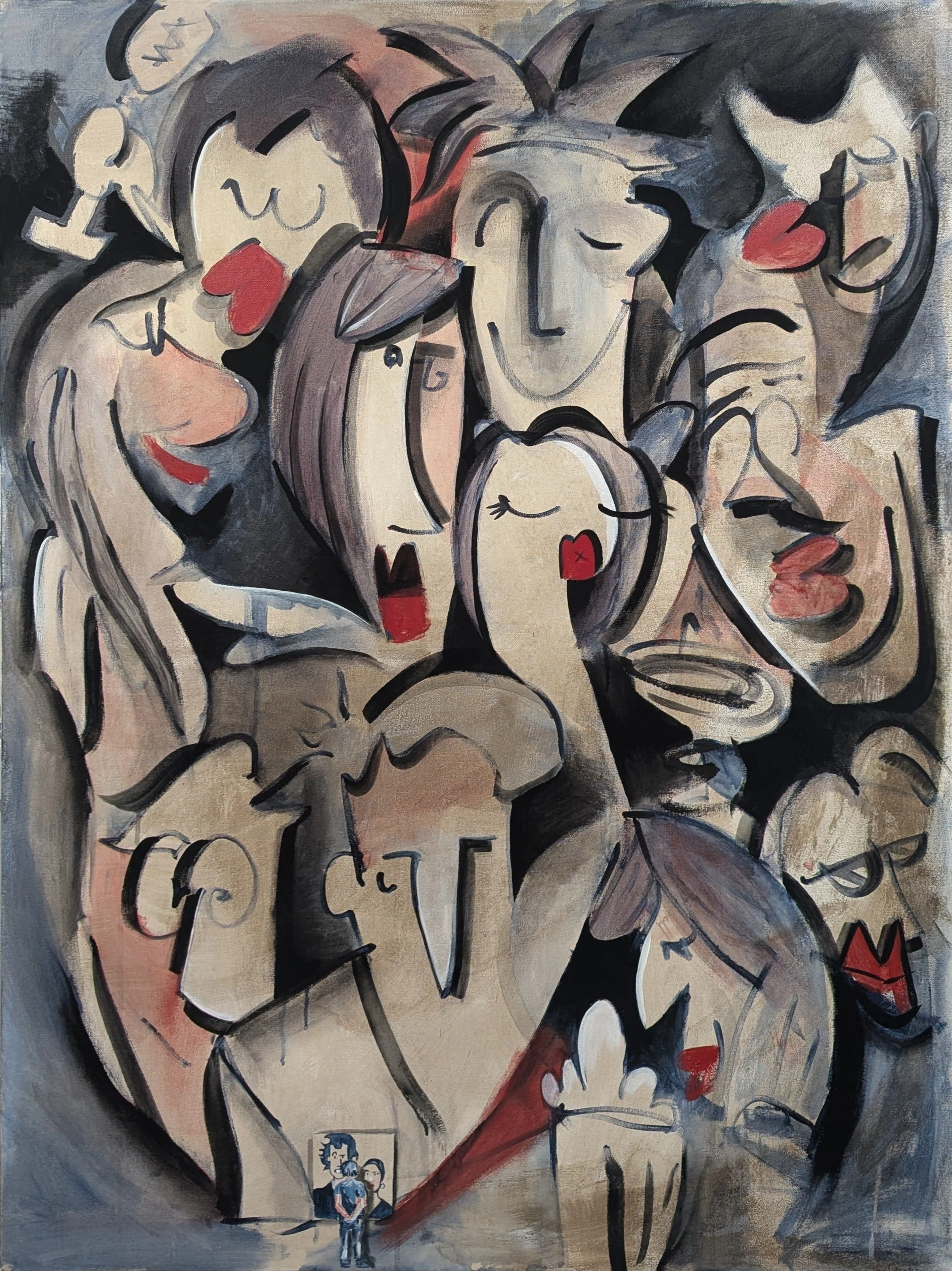
Step Back & Squint
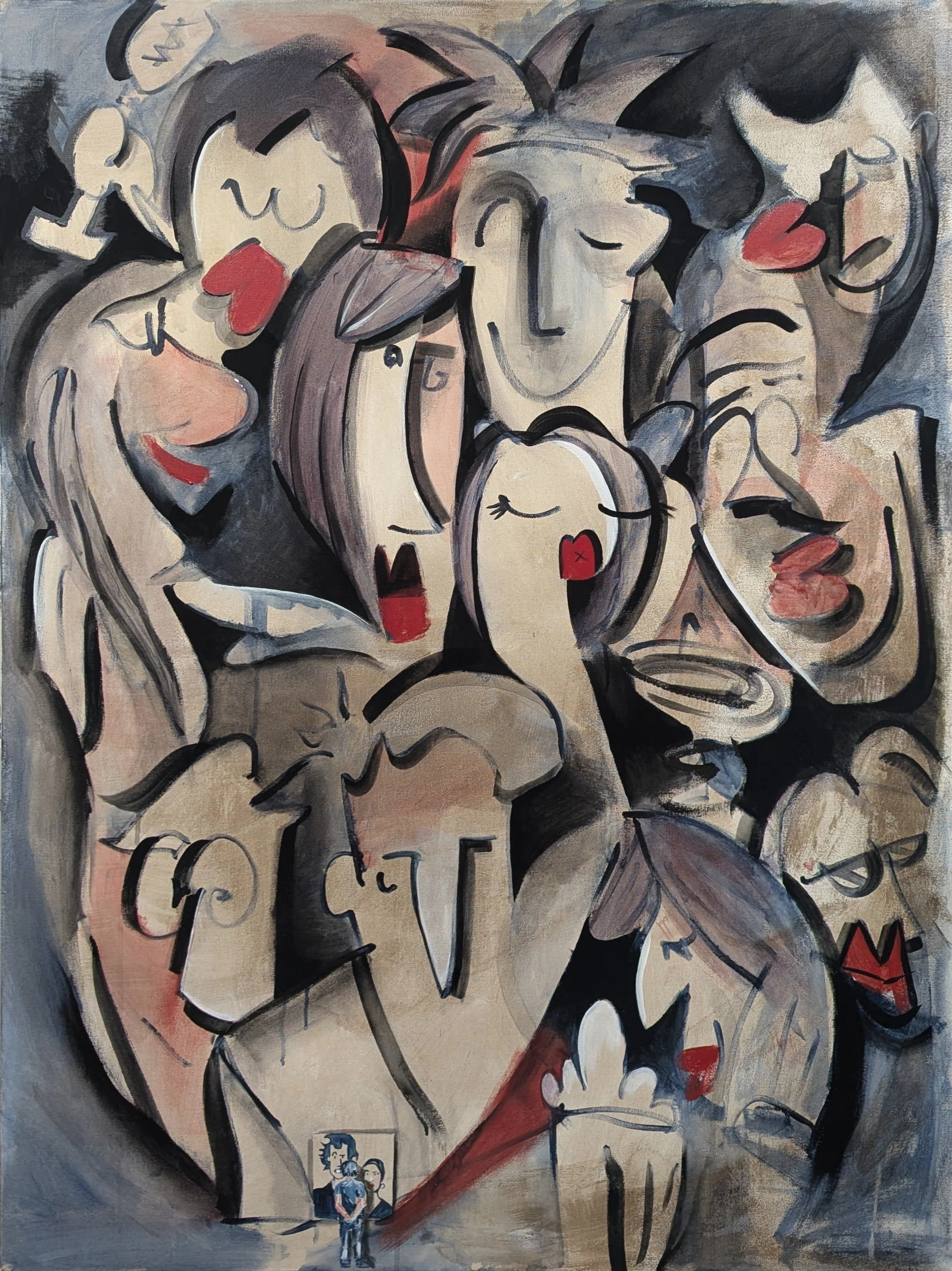
‘Step Back & Squint’ 36” x 48” acrylic on canvas
This painting was originally going to be an amalgamation of 10 picture of me and Laura. The first title was ‘10 years’ even though it’s been 12, because I had been listening to Bo Burnham’s “5 years” and there were 10 reference photos.
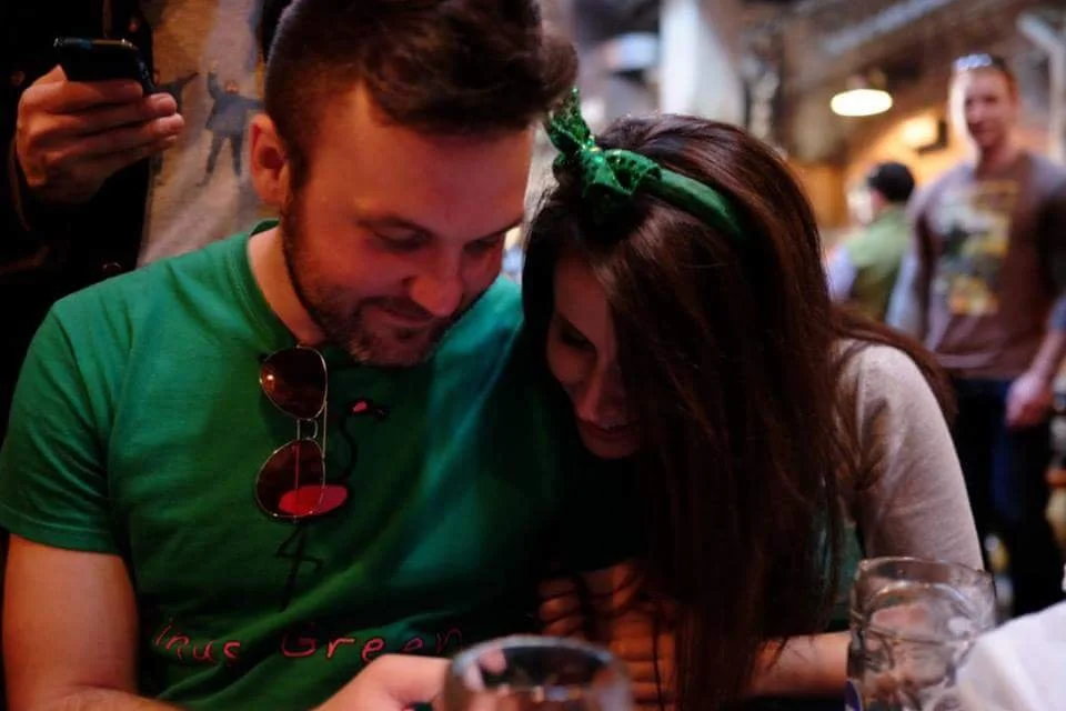
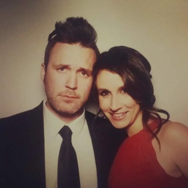
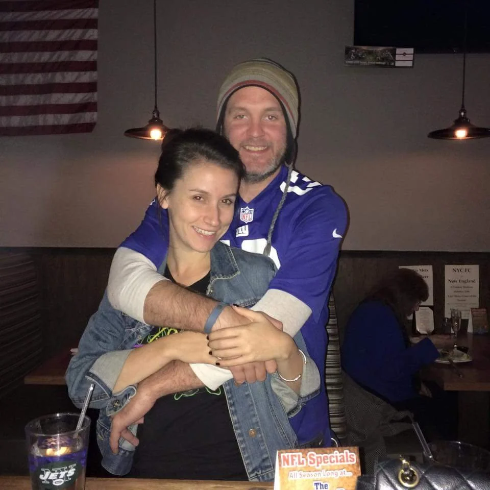
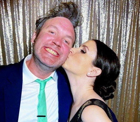
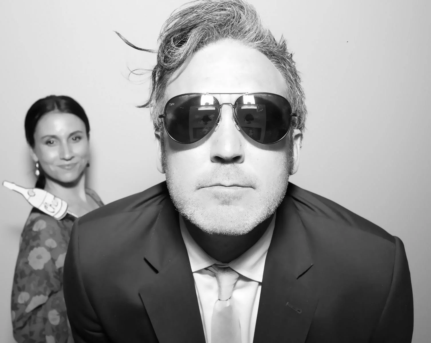
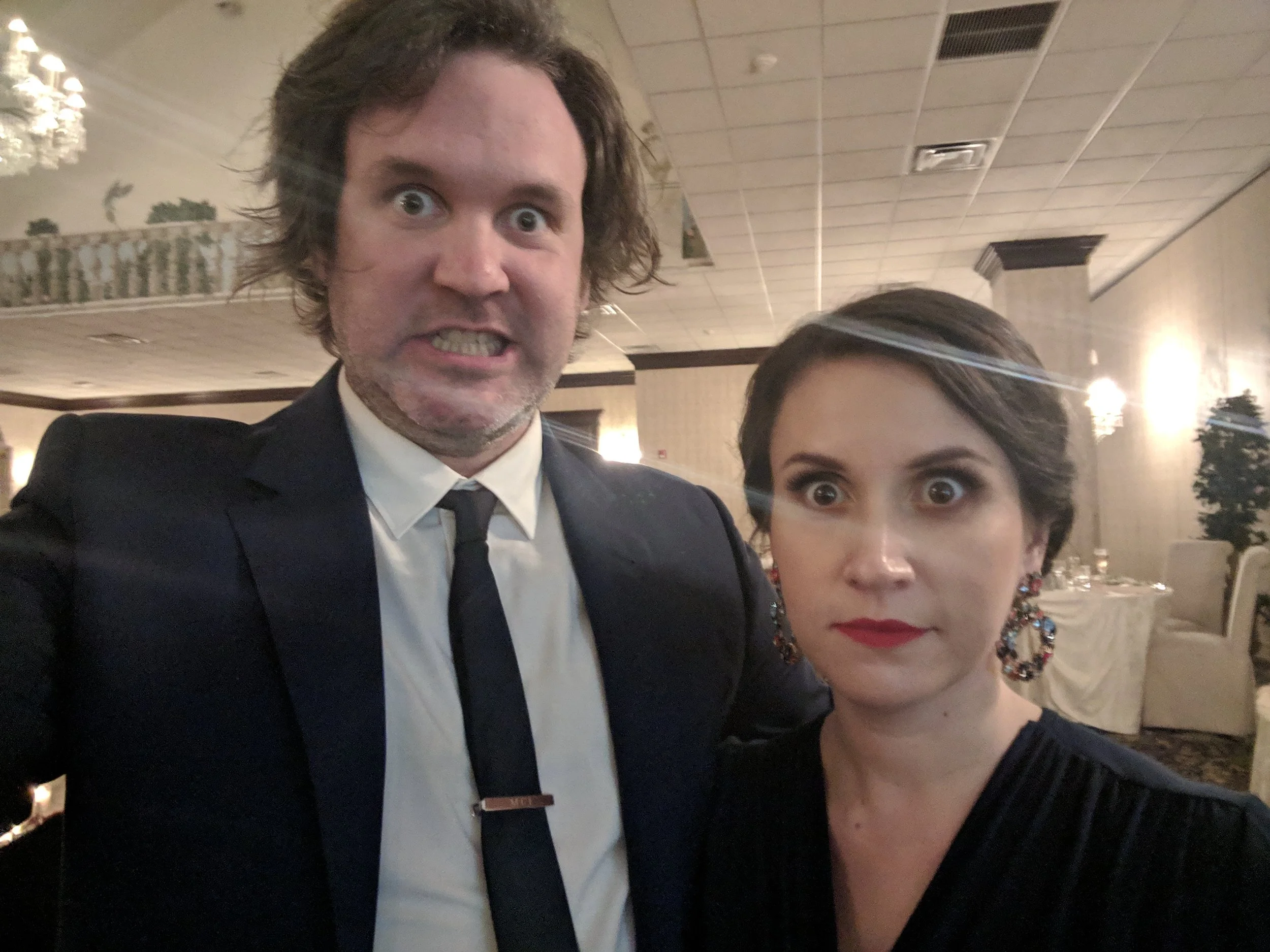
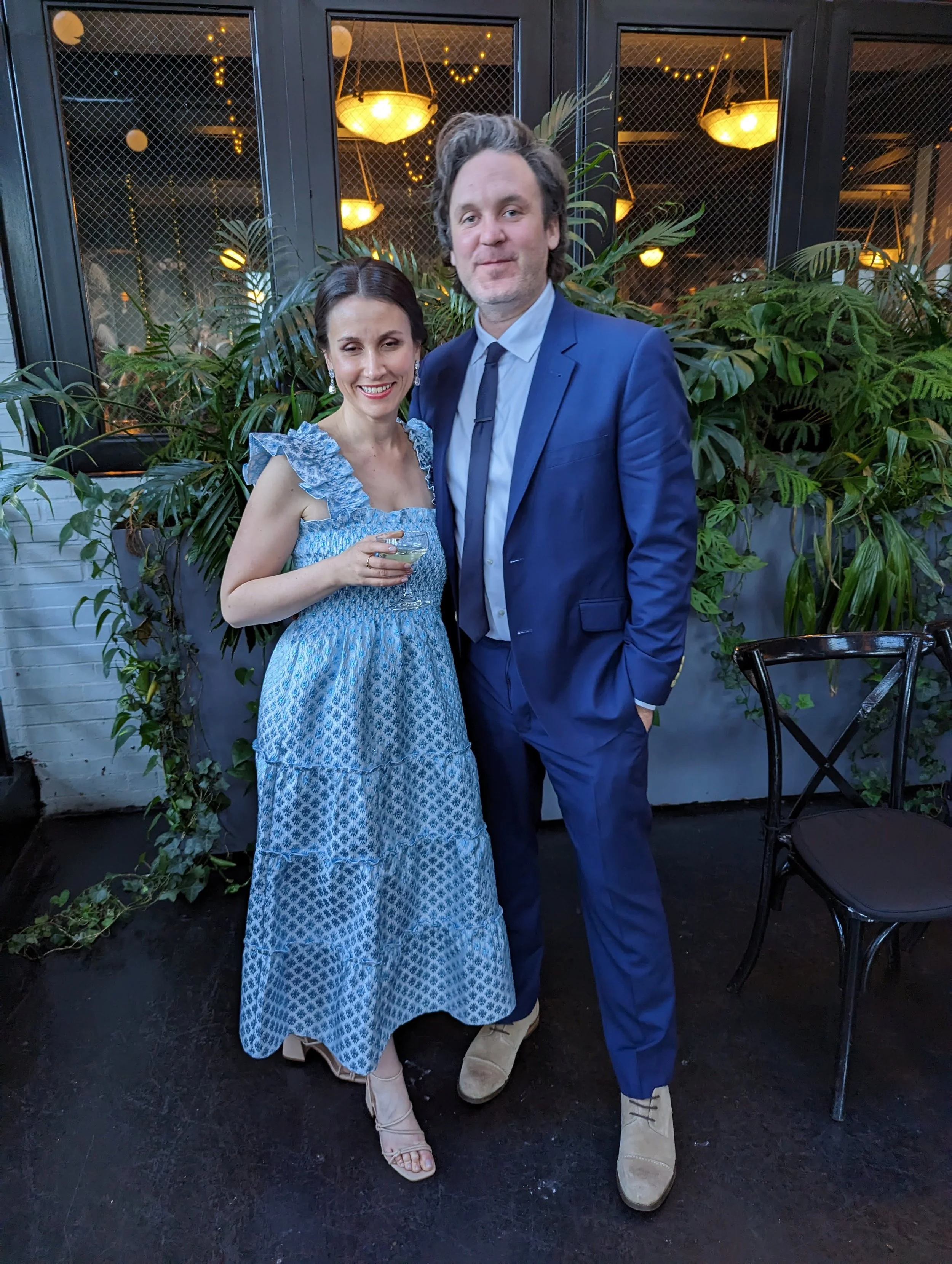
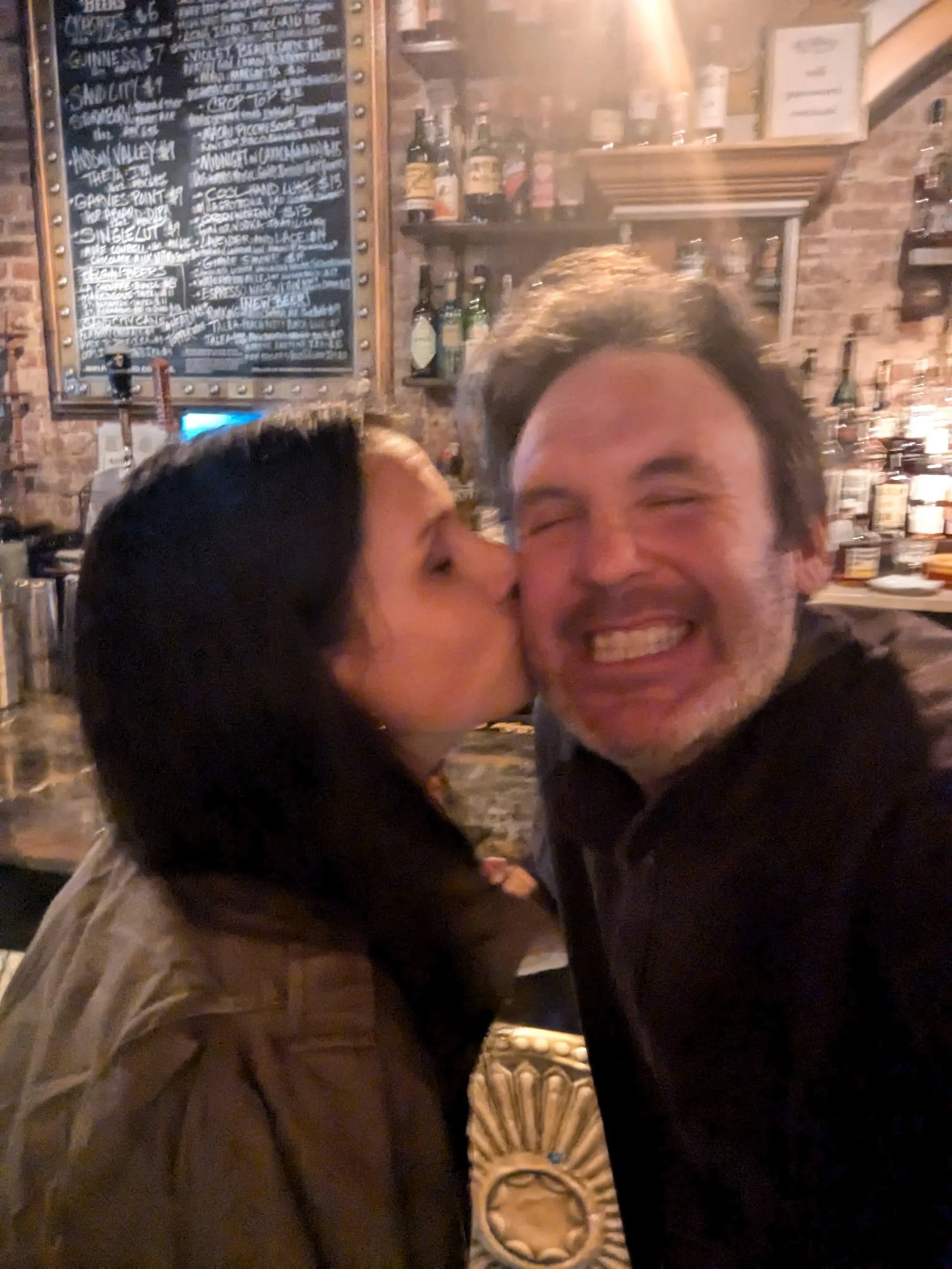
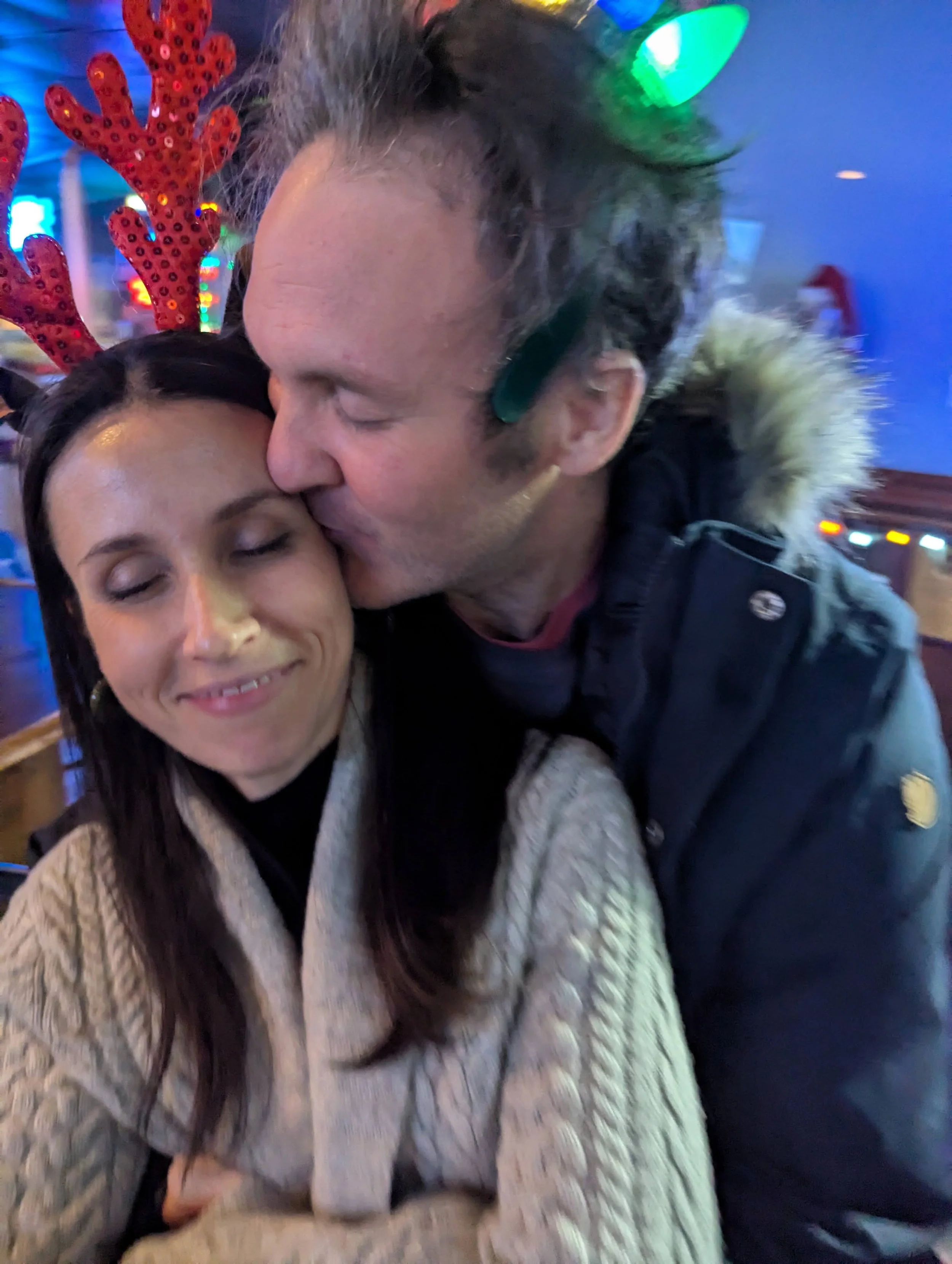
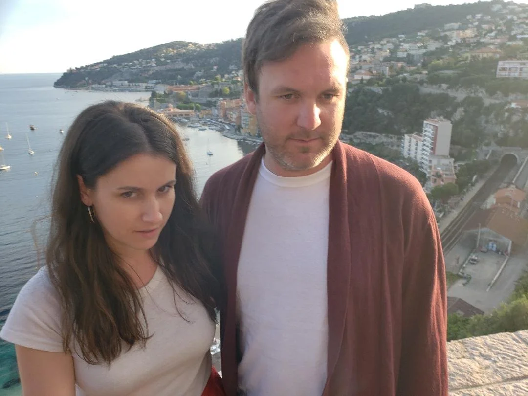
I cut and pasted- somewhat collaged- all 10 references onto the same digital canvas. I started to trace over them but it felt a bit stiff so I lowered the opacity and quickly redrew it. I repeated this step a couple of times trying to get loose and sloppier(?) with each pass. I think I also started drawing it with my arm completely extended and holding the pencil as far back as possible so I had barely any control. I also started playing with adding color, and shadows for depth.


I was happy enough with this idea that it was time to start the actual painting.
I started with a burnt umber/turpenoid wash just to not have a white canvas.
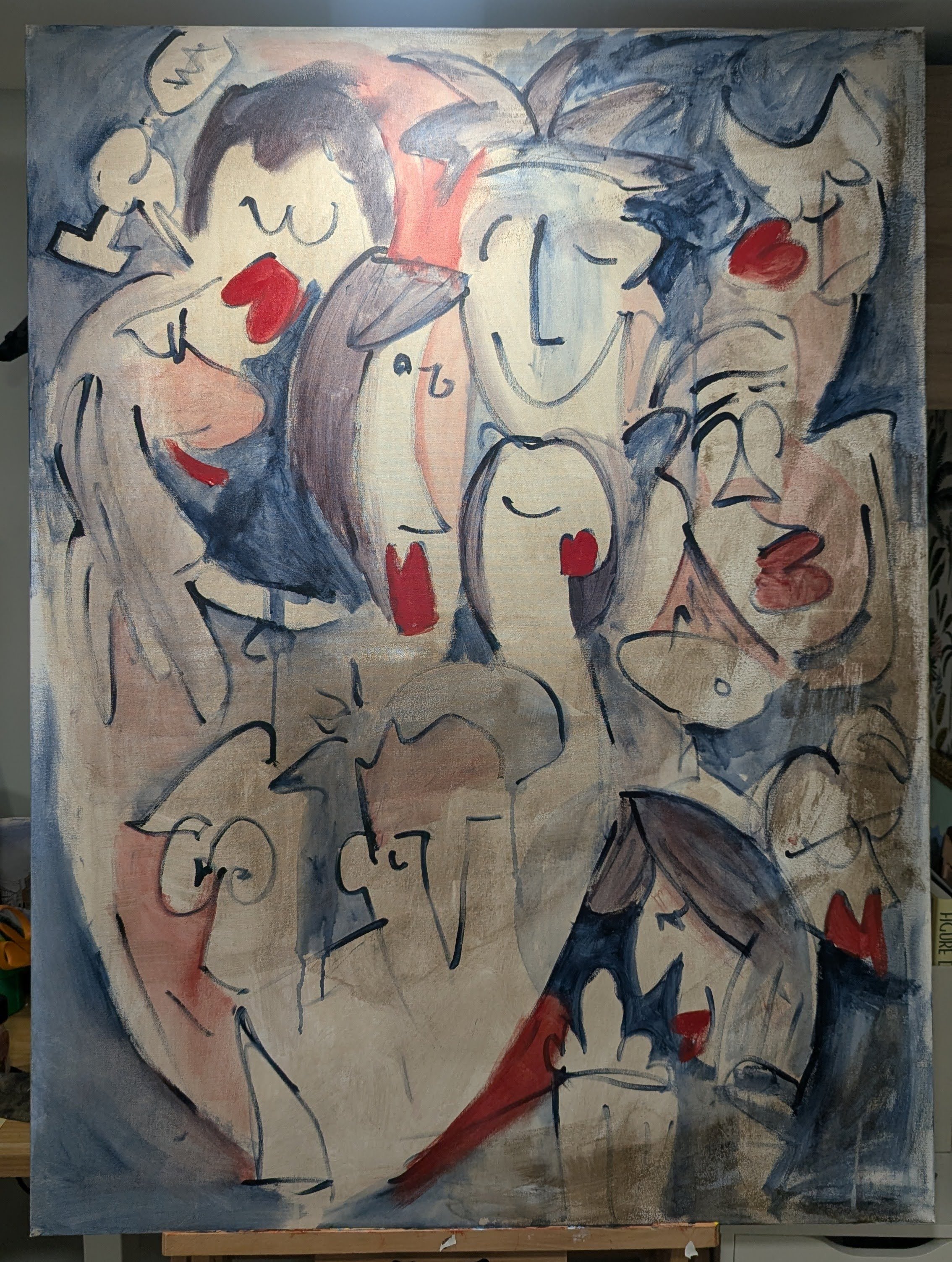
This is the first pass with very wet paint. I believe I used cad red, indigo, and yellow ochre.
I was pretty happy with this. Things got lost and weird. And I was happy about that. From here I knew I needed to add depth which I had started at the bottom above that mug of foamy beer. I was also considering having strips of hyper-realism. Even now looking at that beer mug, I imagine it as having a strip that shows a very real beer.
I pushed that thought a little bit, imagining realism tucked throughout the painting. I just couldn't get myself to want to do it.
Trompe-l’oeil is something I really enjoy looking at and making, but in order to do that, I need to do the hyper-realistic painting. That’s just not fun; I genuinely dislike spending my time doing that.
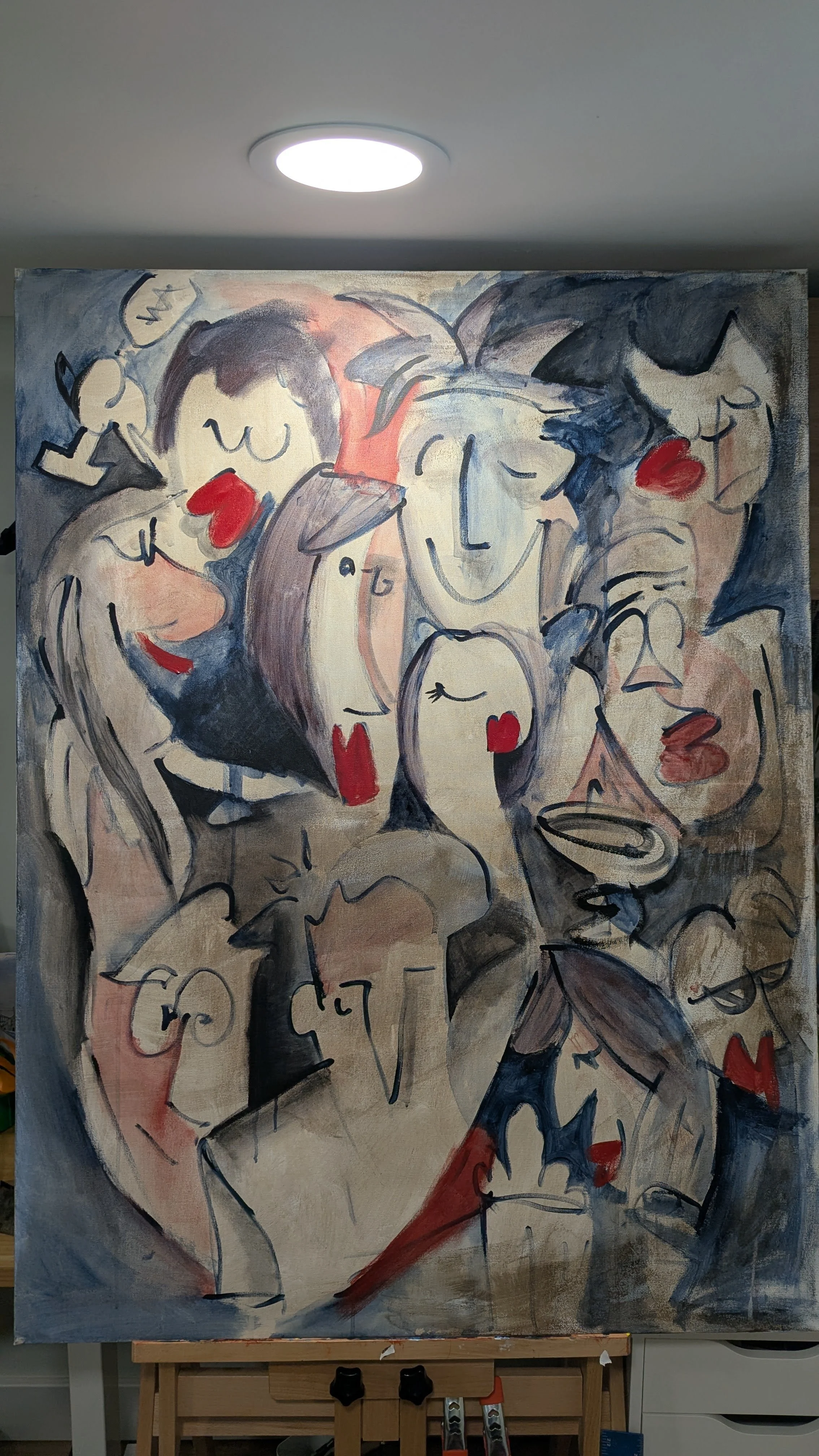
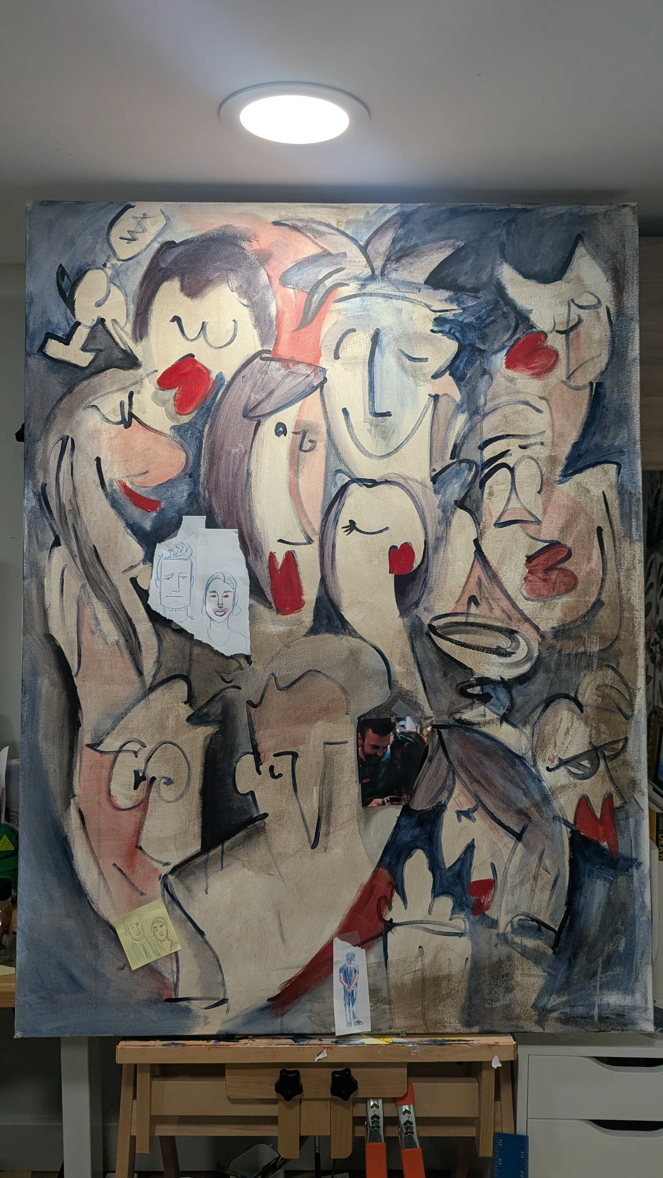
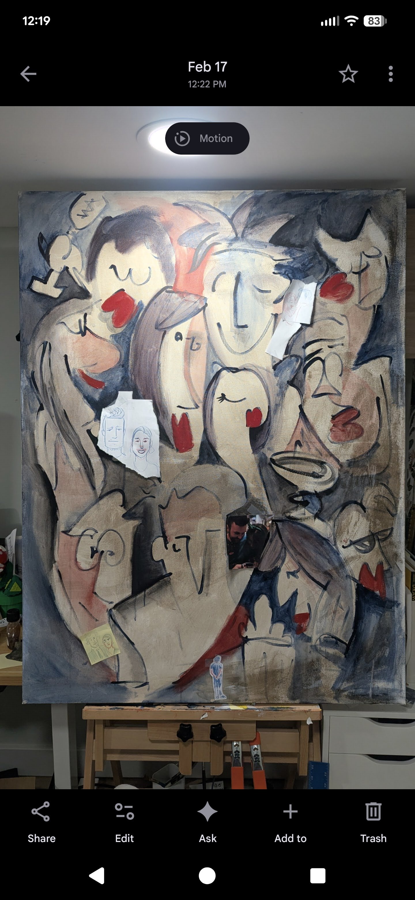
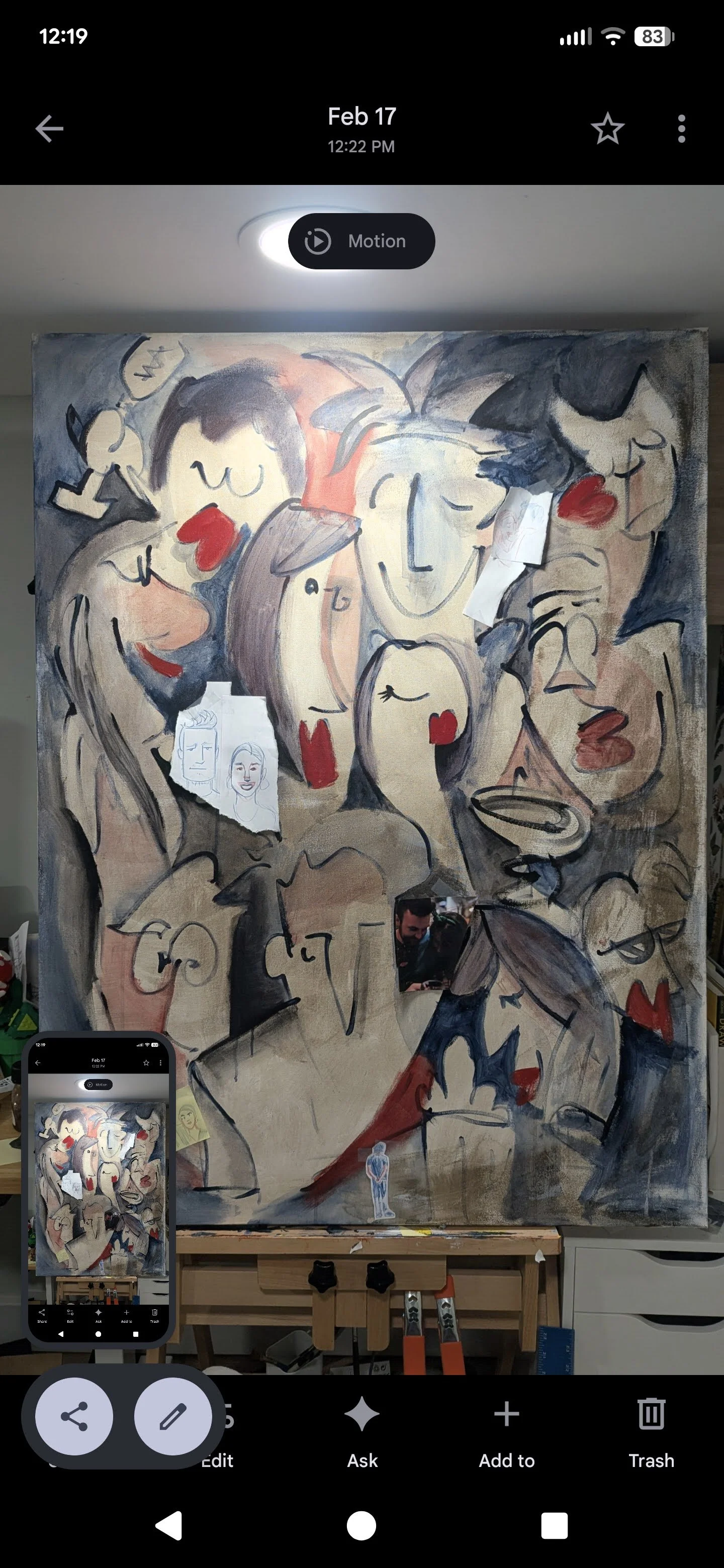
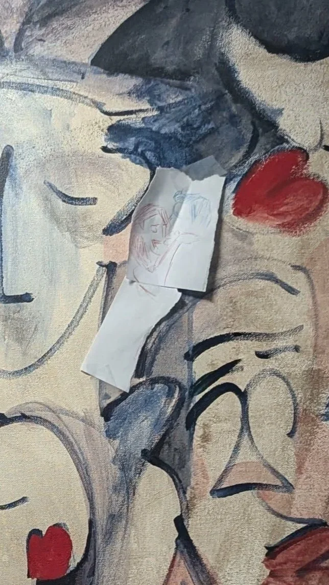
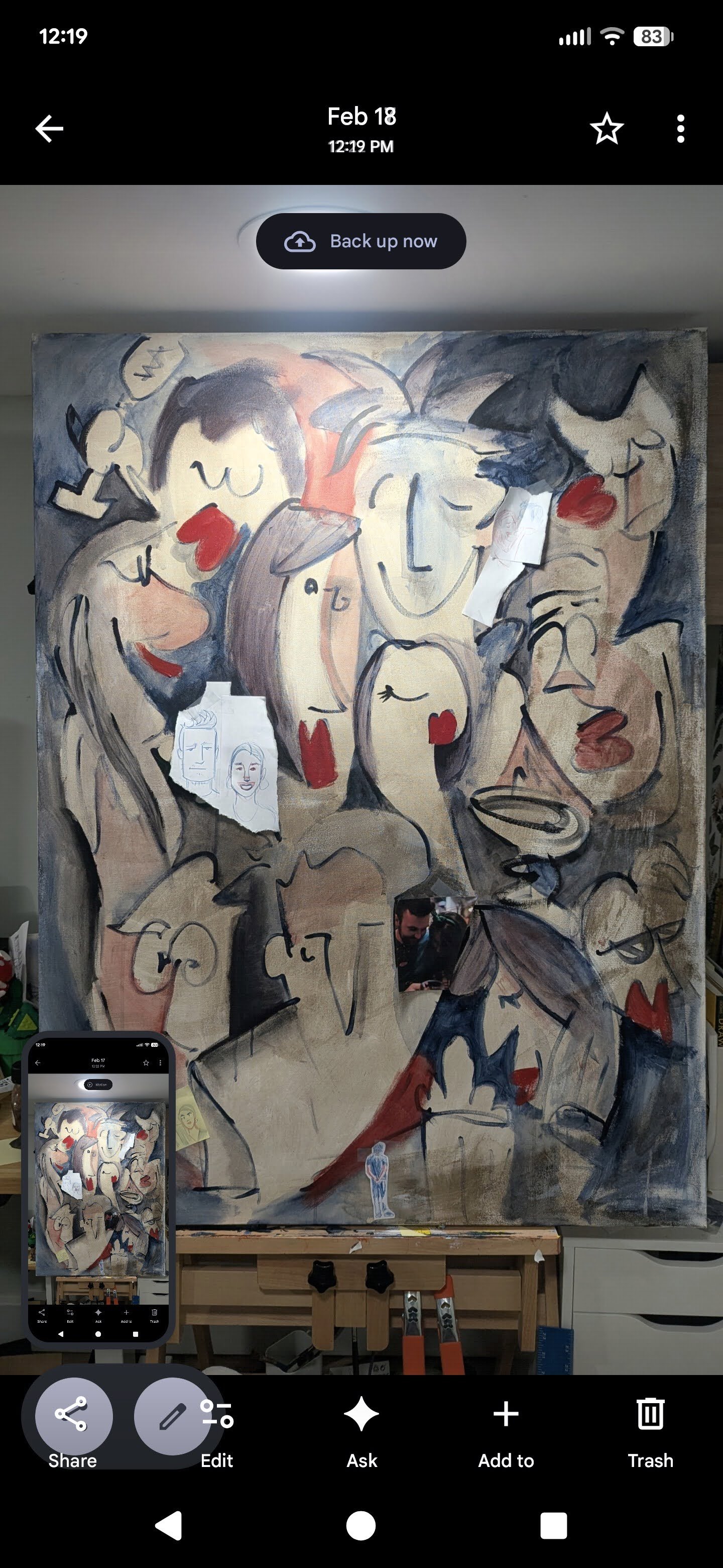
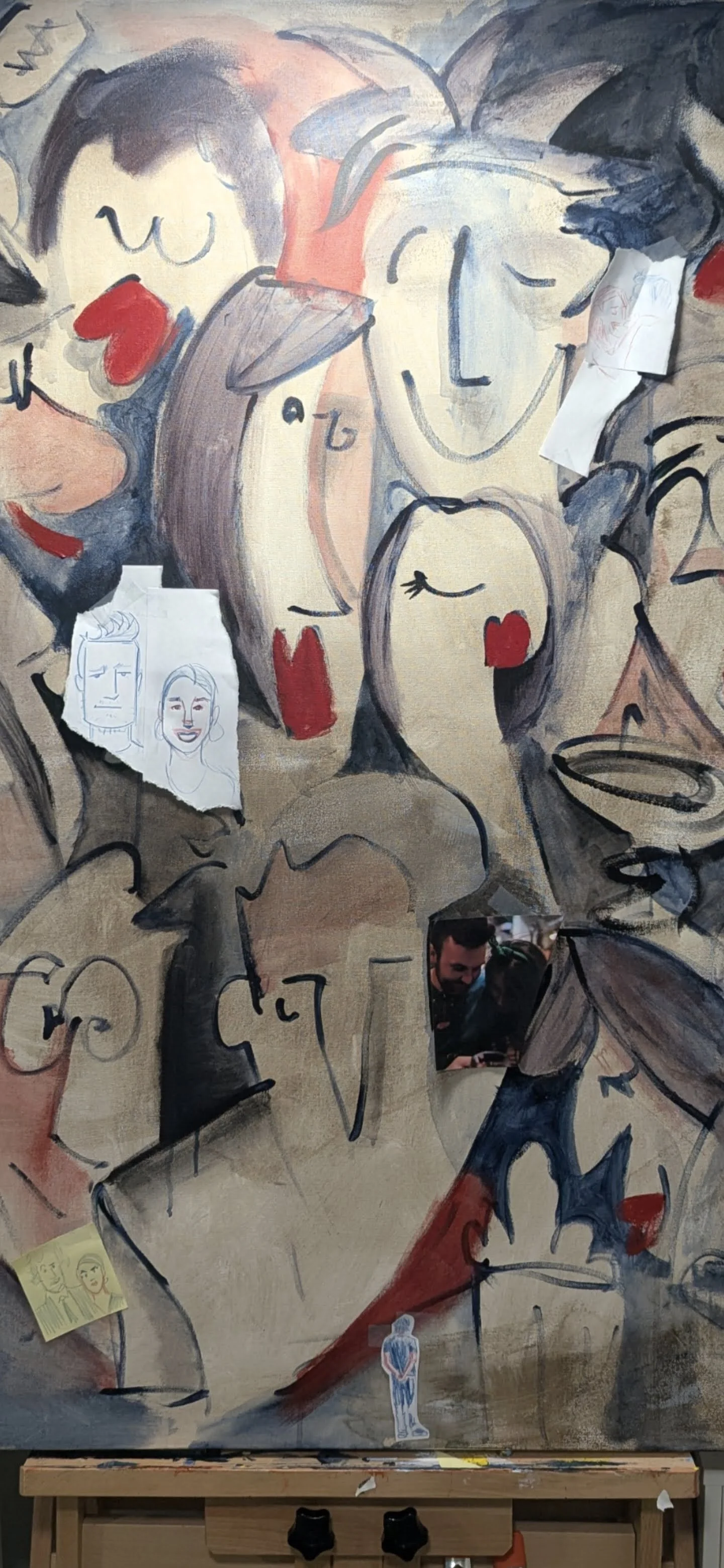
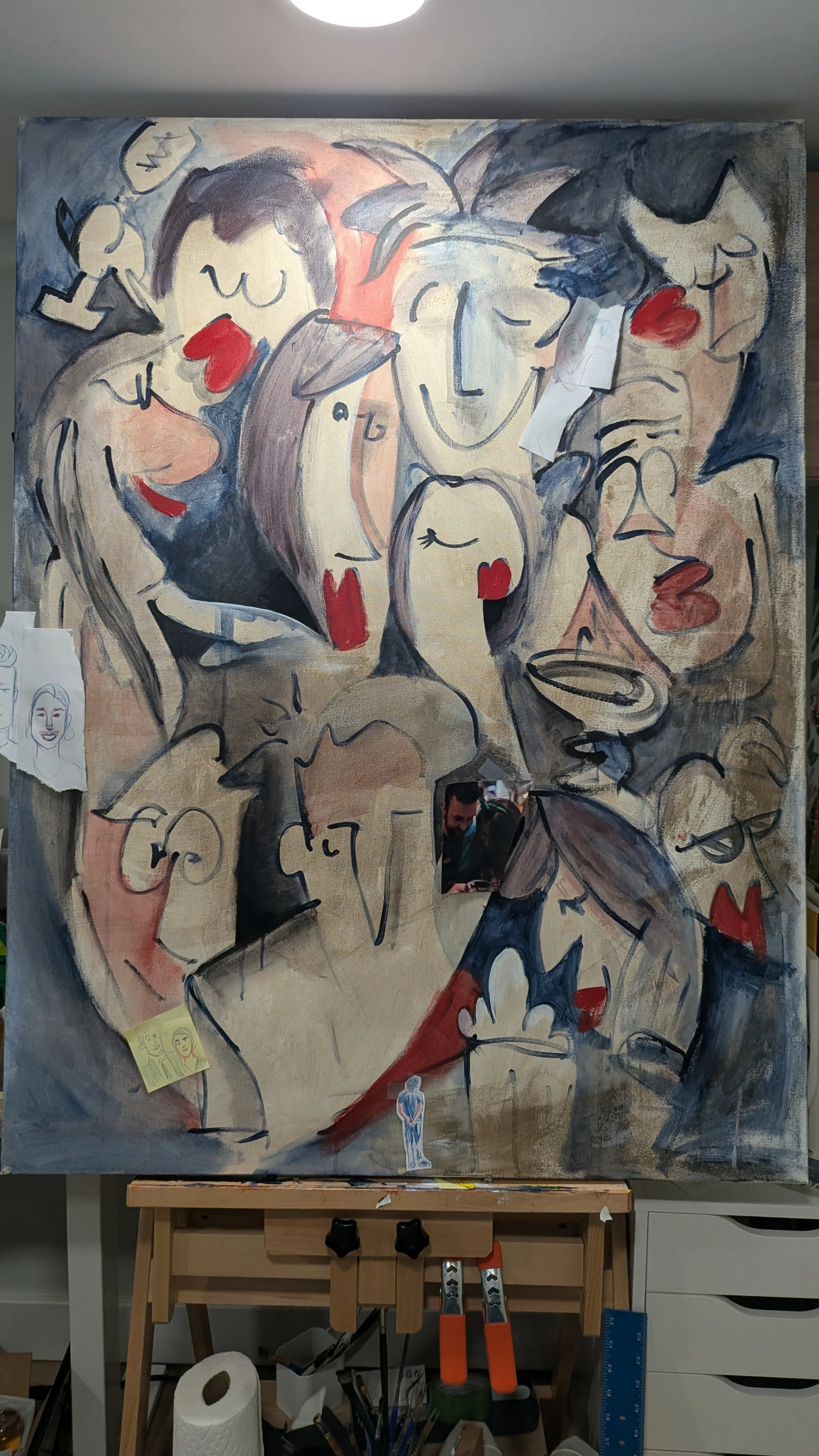
Here I’ve added doodles that I wanted to add realistic painted portraits of throughout the painting. I also remember thinking I really like the shadow of that big one. Thinking it looked like a nose casting a shadow so I wanted to do something with that. I was also taking screenshots of screenshots to try and get a sense of what the painting looked like from far away.
I painted this in my basement and the top of the canvas is bumping up against the ceiling. I imagined the size of a painting in a room with giant ceilings and got the idea to put a little guy at the bottom looking up as if that’s how large the painting was. I then added a smaller painting for him to look at because he seemed weird floating there.
Besides that I think I spent most of the rest of my time on this in adding black, and shadows, and playing around with that.
This painting ended because there was a snowstorm and I spent 4 straight days shoveling which kind of made me lose my focus on this.After reflecting back on this I have a little urge to add some stuff but I’m not one for redo-ing or revisiting work.
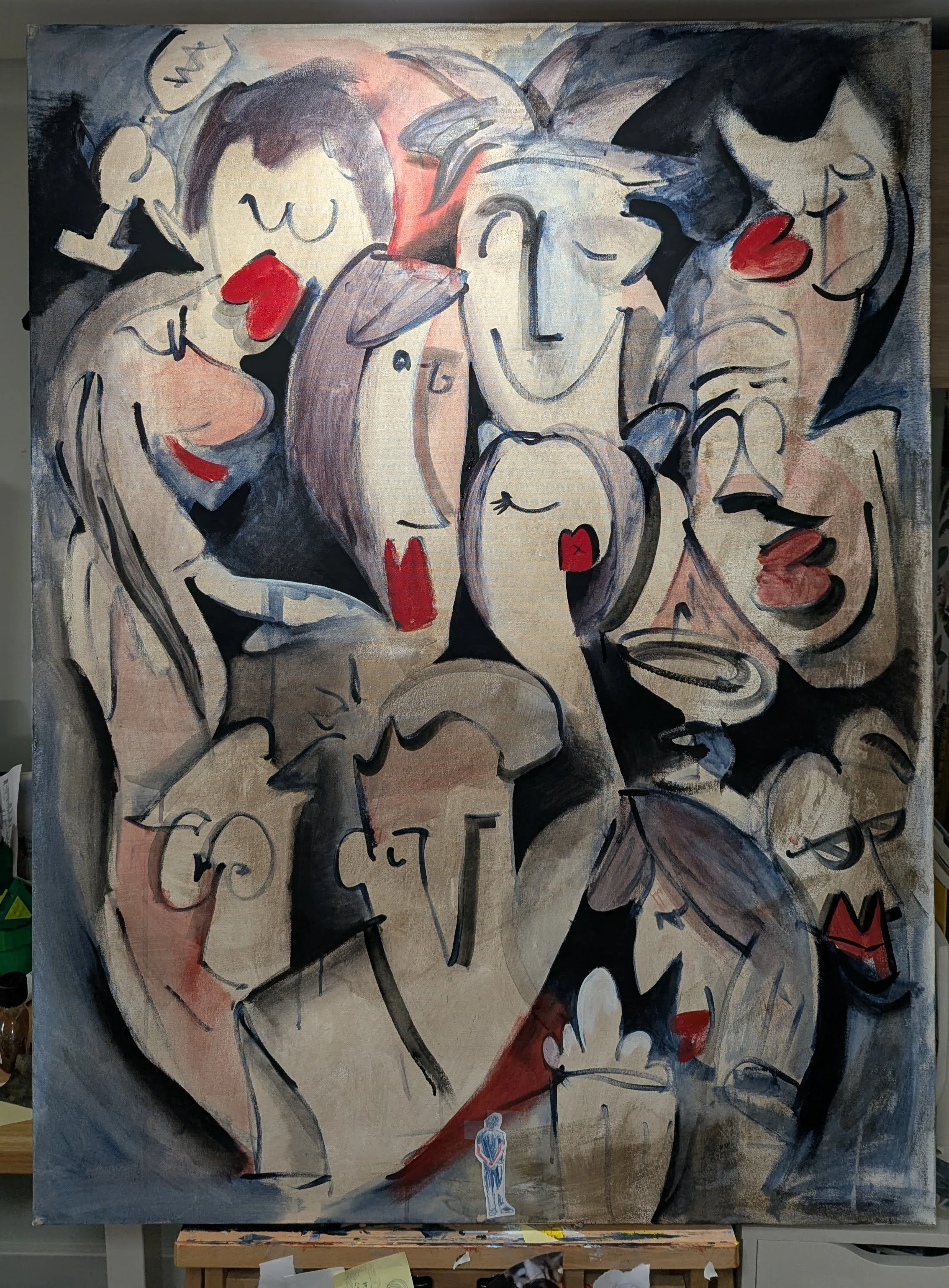
Here’s me adding a lot of black trying to make things pop.
I got some new paints for this painting. The blackest black 4.0 and whitest white 2.0. The black is very very dark and matte. I like it a lot. It’s very unnatural. Legitmately darker than any other paint I’ve used.
The white was almost too bright for this but I’m excited to use it in the fufure.
The name was changed when I wanted to revisit the idea of looking at it from a farther distance. I didn’t actually follow through with doing that, but the name was kind of a joke, hoping viewers would go far away and look at it again and then wondering why, because there was no payoff. How unsatisfying.
This painting was made with the intention of submitting it to the BIG PICTURE exhibition, where all works have the shortest side being at least 36” long. It was submitted but REJECTED which you can read my thoughts about.
Also the painting is for sale.